Copyright © 2004 Eric S. Raymond
This book and its on-line version are distributed under the terms of the Creative Commons Attribution-NoDerivs 1.0 license, with the additional proviso that the right to publish it on paper for sale or other for-profit use is reserved to Pearson Education, Inc. A reference copy of this license may be found at http://creativecommons.org/licenses/by-nd/1.0/legalcode.
| Revision History | ||
|---|---|---|
| Revision 0.1 | April 18 2004 | esr |
| Start of book | ||
Table of Contents
- An Invitation to Usability
- 1. Premises: The Rules of Interface Design
- Usability Metrics
- Usability and the Power Curve
- The Rules of Usability
- Rule of Bliss: Allow your users the luxury of ignorance.
- Rule of Distractions: Allow your users the luxury of inattention.
- Rule of Flow: Allow your users the luxury of attention.
- Rule of Documentation: Documentation is an admission of failure.
- Rule of Least Surprise: In interface design, always do the least surprising thing.
- Rule of Transparency: Every bit of program state that the user has to reason about should be manifest in the interface.
- Rule of Modelessness: The interface's response to user actions should be consistent and never depend on hidden state.
- Rule of Seven: Users can hold at most 7±2 things at once in working storage.
- Rule of Reversibility: Every operation without an undo is a horror story waiting to happen.
- Rule of Confirmation: Every confirmation prompt should be a surprise.
- Rule of Failure: All failures should be lessons in how not to fail.
- Rule of Silence: When a program has nothing surprising to say, it should say nothing.
- Rule of Automation: Never ask the user for any information that you can autodetect, copy, or deduce.
- Rule of Defaults: Choose safe defaults, apply them unobtrusively, and let them be overridden if necessary.
- Rule of Respect: Never mistake keeping things simple for dumbing them down, or vice-versa.
- Rule of Predictability: Predictability is more important than prettiness.
- Rule of Reality: The interface isn't finished till the end-user testing is done.
- Comparison with the Nielsen-Molich Evaluation Method
- Identifying with the User Experience
- 2. History: A Brief History of User Interfaces
- 3. Programming: GUI Construction in the Unix Environment
- 4. Wetware: The Human Side of Interfaces
- 5. Examples: The Good, the Bad, and the Ugly
- 6. Reality: Debugging and Testing User Interface Designs
- A. Design Rule Reference
- B. Bibliography
List of Figures
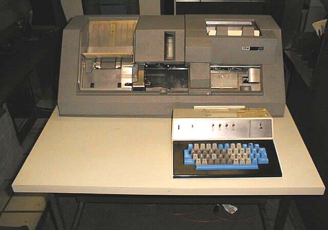
- 2.1. IBM 029 card punch.
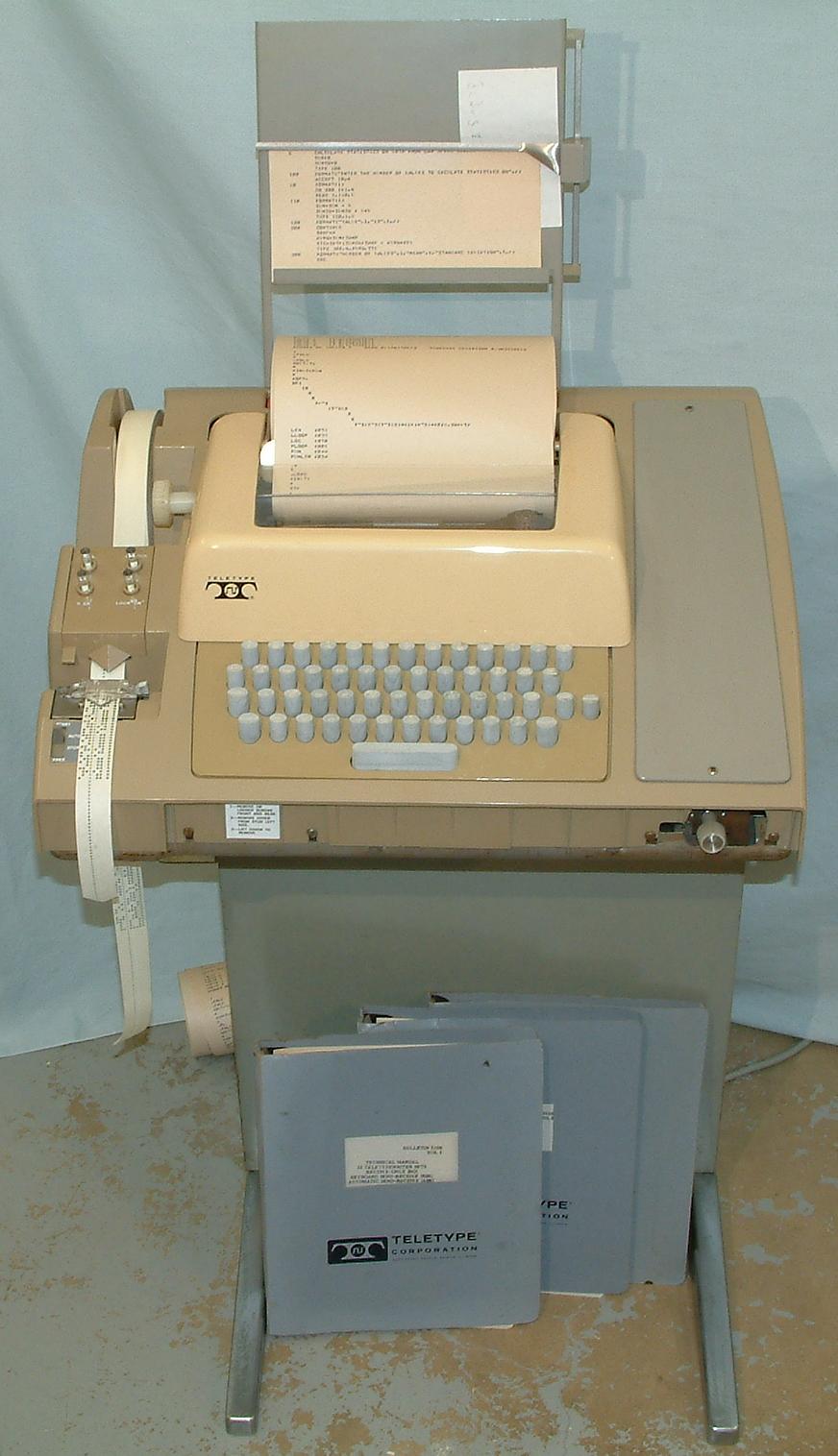
- 2.2. ASR-33 Teletype.
- 2.3. VT100 terminal.
- 2.4. The Xerox Alto.
- 2.5. Alto running the Executive file browser (c.1974).
- 2.6. The Xerox Star (1981).
- 2.7. Screen shot from a Star (1981).
- 2.8. Kickstart on the Amiga 1000 (1985).
- 2.9. Early version of the Macintosh Finder (1985).
- 2.10. Windows 1.0 (1985).
- 2.11. OpenLook (c.1989).
- 2.12. NeXTstep (1988).
- 2.13. Windows 3.0 and 3.1 (1992).
- 2.14. Windows 95 (1995).
- 2.15. Microsoft Bob home screen (1995).
- 3.1. Comparing the X stack to a monolithic graphics system.
- 5.1. CUPS configuration: the saga begins
- 5.2. CUPS configuration: the Queue Name panel
- 5.3. CUPS configuration: the Queue Type panel
- 5.4. CUPS configuration: the stone wall
- 5.5. xmms
- 5.6. xine-ui
- 5.7. gxine
List of Tables
What I saw in the Xerox PARC technology was the caveman interface, you point and you grunt. A massive winding down, regressing away from language, in order to address the technological nervousness of the user.
-- Attributed to an IBM technician lambasting the Apple Lisa, c. 1979This book is about software usability engineering for Unix programmers, the presentational side of Unix software design. Its scope includes not only user interface (UI) design, but other related challenges such as making software easy to install, learn, and administer.
We choose the term “usability engineering” as a deliberate challenge to the all-too-prevalent notion that designing for usability demands special insight into areas like psychology or visual arts that are outside the scope of what programmers can do. We think the belief that usability engineering is a form of arcane magic best left to the exclusive province of specialists is both false and harmful, and is a passive but potent encouragement to slovenly interface design.
Just as damaging is the opposite assumption that usability engineering is trivial, and that usability can be sprayed on to a project after the design phase as though it were a coat of lacquer. The belief that security can be treated that way has caused no end of trouble as the Internet became a mass medium; similarly, the costs of after-the-fact attempts to spray on usability are rising as the potential audience of Linux and other Unixes expands to include more and more non-technical users.
We reject both extremes for the position that usability engineering should be considered a normal part of software design. There will always be a role for usability specialists, but basic competence in usability engineering can and should be part of every programmer's craft — even every Unix programmer's craft.
This book is aimed specifically at programmers operating within the Unix tradition, and especially for developers on modern open-source Unixes such as Linux. In The Art of Unix Programming we described the things Unix programmers do particularly well. In this book, on the other hand, we're going to delve into things Unix programmers have a long history of doing especially poorly. We think that deficit can and should be repaired.
Why start with Unix? The proximate cause is that the authors of this book understand how to address Unix programmers; we're writing for the audience we know. But more generally, we think that a book about usability engineering for Unix can be especially valuable because the Unix culture gets almost everything else right.
It has been famously claimed that all art aspires to the condition of music. If that's so, all operating systems seem to aspire just as insistently to the condition of Unix! One of the most persistent of the repeating patterns in the history of the field is large pieces of Unix getting grafted onto other environments (famously including Microsoft DOS, Microsoft Windows, and Mac OS 9) after their designers have run head-on into the limits of their original architectural model.
The planners behind Macintosh OS X noticed this, and concluded that it would work better to start from the solid architectural foundations of Unix and fix Unix's usability superstructure than to start from a highly usable but structurally weak operating system like Mac OS 9 and try to repair the foundations. The remarkable success of Linux at competing with Windows after 1995 suggests a similar conclusion.
As with architectures, so with architects. We believe Unix programmers who manage to integrate usability engineering into their craft will write fundamentally better software than usability-savvy programmers from other traditions trying belatedly to absorb Unix's architectural lessons in other areas like stability, security, and maintainability.
In the past, much of existing literature on software usability engineering has been tied to a specific non-Unix environment, or for other reasons written in an idiom that Unix programmers have trouble understanding. We began this book with the goal of bridging that gap.
We are aware that we are fighting a considerable weight of history in our attempt. Historically, hard-core Unix programmers have tended to be systems and networking hackers with little interest in — even an active disdain for — end-user applications and user interfaces. More specifically, the Unix culture has a long tradition of dismissing graphical user interfaces with the sour attitude recorded in the epigraph of this chapter.
In The Art of Unix Programming[TAOUP], we argued vigorously that there is more than a little justice in the anti-GUI case, and that Unix's tradition of command-line and scriptable interfaces has powerful virtues which have often tended to get lost in waves of consumer-oriented hype. But we think the rise of the Unix-centered open-source movement is making a big difference here. It has certainly made many people outside the Unix camp more willing than ever before to listen to the case for the old-school Unix gospel of the pipe, the script, and the command line. And we believe that it has made Unix programmers themselves less prickly and defensive, more willing to accept the best from the GUI tradition rather than dismissing it as gaudy trash. Modern open-source Unixes like Linux are observably GUI-intensive to a degree that would have been barely imaginable even a decade ago, and younger Linux programmers especially seem to be trying to find an accommodation that discards neither the GUI nor the best of the Unix old school.
We think, or at least hope, that the Unix community is ready to develop a healthy indigenous tradition of GUI design, one which does not merely imitate older models but integrates them with Unix's native design rules and best practices. We see promise for this project in the fact that Unix has often led the way in GUI technology and infrastructure even as it lagged badly in GUI design. We hope that this book will help systematize the ideas and insights that Unix community has been developing for itself and borrowing from elsewhere as it has slowly struggled to come to terms with the GUI.
More generally, we have written this book because we think we have detected signs that today's Unix community is ready to seriously take on usability issues — to accept them a challenge worthy of the same tremendous intelligence and effort that it has brought to its more traditional infrastructure concerns.
Our exposition will build on [TAOUP]). That book was an informal pattern language of Unix design, capturing Unix practice as it is. Much of it was concerned with developing a vocabulary (centered around terms like transparency, orthogonality, and discoverability) in which the implicit knowledge of the Unix tradition could be made explicit. In this book, we'll extend that vocabularity into the domain of usability engineering.
We'll use a combination of case studies with analysis similar to that in [TAOUP], and on a few topics we'll reuse bits of that book.[1] However, the emphasis in this book will be very different. Where discussion of interfaces in [TAOUP] was primarily geared to explaining the persistence of non-visual interfaces for sophisticated users under Unix, we will be focusing here on the design of interfaces for nontechnical end-users, and specifically on graphical user interfaces (GUIs).
As with other aspects of design, usability engineering combines inspiration with learned skill. We can't supply the inspiration, but we can help you learn a vocabulary, some tools, and some technique.
One final note: The world is full of books about software design that urge programmers to swallow heavy methodological prescriptions like a dose of castor oil, grimly admitting that the stuff tastes nasty but insisting it's good for your character. This book is not one of those. We believe that one of the characteristics of great software designs, whether in the internals of code or its user interfaces, is playfulness. We believe that effective software-design methods are playful as well, because pleasure is what human beings experience when they are operating at their highest sustainable levels of effort and creativity.
Accordingly, we hope (and believe) that this book will not only teach you how to be a better programmer, but show you how to have new kinds of fun in the process. So when we say that we hope you'll enjoy this book, it is not just a conventional gesture of fond hope, it's actually our most serious methodological prescription. Enjoy what you learn here, because that's how you'll do a better job.
[1] Specifically, the places where we have reused TAOUP material are in (1) the definitions of terms in the Premises chapter, and (2) the comparison of X toolkits in the Programming chapter. To the reader interested in exploring Unix's native non-GUI design tradition we recommend the Interfaces chapter.
Table of Contents
- Usability Metrics
- Usability and the Power Curve
- The Rules of Usability
- Rule of Bliss: Allow your users the luxury of ignorance.
- Rule of Distractions: Allow your users the luxury of inattention.
- Rule of Flow: Allow your users the luxury of attention.
- Rule of Documentation: Documentation is an admission of failure.
- Rule of Least Surprise: In interface design, always do the least surprising thing.
- Rule of Transparency: Every bit of program state that the user has to reason about should be manifest in the interface.
- Rule of Modelessness: The interface's response to user actions should be consistent and never depend on hidden state.
- Rule of Seven: Users can hold at most 7±2 things at once in working storage.
- Rule of Reversibility: Every operation without an undo is a horror story waiting to happen.
- Rule of Confirmation: Every confirmation prompt should be a surprise.
- Rule of Failure: All failures should be lessons in how not to fail.
- Rule of Silence: When a program has nothing surprising to say, it should say nothing.
- Rule of Automation: Never ask the user for any information that you can autodetect, copy, or deduce.
- Rule of Defaults: Choose safe defaults, apply them unobtrusively, and let them be overridden if necessary.
- Rule of Respect: Never mistake keeping things simple for dumbing them down, or vice-versa.
- Rule of Predictability: Predictability is more important than prettiness.
- Rule of Reality: The interface isn't finished till the end-user testing is done.
- Comparison with the Nielsen-Molich Evaluation Method
- Identifying with the User Experience
In the beginner's mind there are many possibilities, but in the expert's there are few.
-- Zen Mind, Beginner's Mind (1972)Usability engineering is like other forms of art and engineering in that some of what informs the practice is aesthetic intuition, but most of it is following rules. The intercourse between rule-bound form and intuitive spark is exactly where creativity happens; style (as a famous literary dictum has it) is the contrast between expectation and surprise.
Usability specialists often have a tendency to exaggerate the degree of intuition and inspiration involved, in part because they are sometimes unaware of the rules they are following (and some are not aware of following rules at all). But the rules of good usability engineering that have emerged from our experience with software interfaces since 1945 are remarkably consistent, both within themselves and with what we've learned from other areas of industrial design. Applying these involves difficult tradeoffs in the same way engineering always does, but there is nothing particularly complex or mystical about the rules themselves.
In [TAOUP] we introduced five basic metrics to categorize the quality of interfaces: concision, expressiveness, ease, transparency, and scriptability.
Concise interfaces have a low upper bound on the length and complexity of actions required to do a transaction; the measurement might be in keystrokes, gestures, or seconds of attention required. Concise interfaces get a lot of leverage out of relatively few controls.
Expressive interfaces can readily be used to command a wide variety of actions. Sufficiently expressive interfaces can command combinations of actions not anticipated by the designer of the program, but which nevertheless give the user useful and consistent results.
The difference between concision and expressiveness is an important one. Consider two different ways of entering text: from a keyboard, or by picking characters from a screen display with mouse clicks. These have equal expressiveness, but the keyboard is more concise (as we can easily verify by comparing average text-entry speeds). On the other hand, consider two dialects of the same programming language, one with a Unicode-string type and one not. Within the problem domain they have in common, their concision will be identical; but for anyone concerned with internationalization, the dialect with Unicode characters will be much more expressive.
Ease is inversely proportional to the mnemonic load the interface puts on the user — how many things (commands, gestures, primitive concepts) the user has to remember specifically to support using that interface. Programming languages have a high mnemonic load and low ease; menus and well-labeled on-screen buttons are easier to learn and use, but usually trade away concision or expressiveness for this virtue.
Transparent interfaces don't require the user to remember the state of his problem, his data, or his program while using the interface. An interface has high transparency when it naturally presents intermediate results, useful feedback, and error notifications on the effects of a user's actions. So-called WYSIWYG (What You See Is What You Get) interfaces are intended to maximize transparency, but can sometimes backfire — especially by presenting an over-simplified view of the domain.
Discoverable interfaces make it easy for the user to form and maintain a mental model not of the problem domain, but of the user interface itself. Discoverable interfaces usually leverage the user's understanding of the problem domain to help them figure out the controls. Various forms of assistance like on-screen labels, context sensitive help, or explanatory balloon popups can increase discoverability. But more important are qualities like the ability to experiment without damaging anything, and immediate feedback to let the user know what they just did when they try something. A truly discoverable interface makes the relationship between the controls and the task they perform intuitively obvious, and rewards experimentation rather than punishing it.
These virtues also have negative formulations in terms of staying out of the user's way. A concise interface doesn't get in the way by forcing the user to wade through a lot of waste motion to get the work done. An expressive interface doesn't get in the way by imposing the programmer's preconceptions about what the user is there to accomplish and how they're likely to go about it. An interface with ease doesn't get in the way by requiring users to learn and remember lots of non-obvious controls. A transparent interface doesn't get in the way by obscuring the state of the problem. A discoverable interface doesn't get in the way by requiring the user to attend a training course or read a manual.
For completeness, we'll note that scriptable interfaces is are those which are readily manipulated by other programs. Scriptability reduces the need for costly custom coding and makes it relatively easy to automate repetitive tasks. Scriptability will not be a major theme in this book; see [TAOUP], instead, for an in-depth discussion.
Usability is not one thing. It's actually a relationship between a program and its audiences. A program's usability changes as the audience changes; in particular, best practices for usability engineering change as its audiences' degrees of investment in the task and the software changes. We'll find it useful, later on, to distinguish at least four different kinds of user from each other.
The nontechnical end-user has very little knowledge of either the application domain of your program or of computers and software in general, and is probably not very interested in acquiring more of either. Most users of ATMs (automatic teller machines), for example, fall in this category.
The domain expert has a lot of domain knowledge about the application your program addresses, but is unsophisticated about computers. Domain experts are usually motivated to learn more about their domain, but not necessarily about computers in general.
The power user has a lot of experience with computers and different kinds of software, but limited domain-specific knowledge. Power users (like domain experts) are often willing to learn more about what they are already good at, but may resist acquiring more domain knowledge.
The wizard or guru is strong in both domain-specific and general computer knowledge, and is willing to work at getting more of either.
Of course, the degree to which any one persion is a domain expert varies with the domain. And even wizards don't want to have to be wizards all the time; even a software guru who enjoys programming (say) printer drivers usually just wants to press a button and have the printer print without fuss or fiddling.
Nevertheless, these four categories do define a power curve — nontechnical end-users at the low end, wizards at the high end, domain experts and power users in the middle. Their requirements and the kinds of interfaces that make them comfortable will differ. Just as importantly, an individual's requirements will change as he or she climbs the power curve.
In [TAOUP] we noted that while nontechnical end-users value ease most, wizards will trade that away to get expressiveness and concision. In this book we'll explain and analyze that tradeoff further, focusing on the tension between task-oriented and feature-oriented interfaces.
Many collections of user interface guidelines focus on the visual and presentational level of UI design — representative advice of this kind is to avoid using color alone to convey critical information, because about 10% of users have some variety of color blindness. Advice like this has its place, and we'll convey a good deal of it later in the book, but treatments that go at the UI design problem from the outside in often fail to engage deeper issues. The rules we choose to begin this book with are quite deliberately different — structural and logical, working from the inside out and (we believe) grounded in deep properties of the evolved nature of human beings.
These rules of usability are actually rules for programmers, who (almost by definition) are either power users or wizards. They are therefore aimed at programmers looking down the power curve, designing for an audience of domain experts and nontechnical end-users. But as we've already seen, even wizards are in the end-user position much of the time (especially when operating outside the specific realm of their domain knowledge). Therefore, you should consider these rules applicable for designing any program with an interactive interface.
We'll summarize the rules here, noting parallels with the Unix design rules from The Art of Unix Programming. While these rules are implicit in most good treatments of user-interface design, many have never before been written down explicitly. The rest of this book will unfold the implications and consequences of these rules.
Today's computer users live in an information-saturated society, coping with a frenetic pace of change and living lives that consequently keep their ability to adapt and learn under constant challenge. Under these circumstances, the most precious gift a software designer can give is the luxury of ignorance — interfaces that don't require the consumer to learn another skill, to memorize more details, to shoulder yet another cognitive load.
Simplify, simplify, simplify. Look for features that cost more in interface complexity than they're worth and remove them. When you add features, make them unobtrusive so the user does not have to learn them until he or she is ready (there is a tradeoff here; it's easy to make them too hard to find so that the user never does).
To support the luxury of ignorance, write interfaces that are task-oriented rather than feature-oriented. Task-oriented interfaces walk the user through common sequences of operations, the opposite of the traditional Unix approach that exposes every possible feature switch but forces the user to learn the sequence of operations to accomplish a task. If your program must serve both nontechnical end-users and wizards, then the UI will need to support both task- and feature-oriented interfaces separately. Attempting to combine the two in a single set of controls almost invariably leads to an ugly mess.
One of the effects of an information- and media-saturated world is that people have to budget their attention as well as their learning capacity, and to learn to juggle multiple tasks routinely. Therefore, an equally important gift is the luxury of inattention — interfaces that don't require users to concentrate or change their mental focus from whatever else they are doing. Sometimes this is not a luxury; the task the computer is assisting may demand total attention — but it is nevertheless bad practice to assume that you can get and keep that.
One good test for an interface design is, therefore: can it be worked comfortably while the user is eating a sandwich, or driving a car, or using a cellphone? The real issue here isn't the challenge to physical dexterity but whether the software fits the user's hand and brain well enough to be useful even when the user's attention is divided.
Sometimes juggling multiple tasks won't do. High performance at writing, programming, and other forms of creative work almost requires human beings to enter a what psychologist Mihaly Csikszentmihalyi has dubbed a flow state — intense but relaxed concentration, with total focus on the task.
Flow states, alas, are very fragile. They take time to establish and are easily broken by distractions. Badly-designed UIs are frequent culprits. Blinking text, graphical animations, popup windows, and intrusive sound effects can be nearly as disruptive as the flow state's deadliest enemy, the ringing telephone.[2]
Well-designed interfaces do not clamor for attention or advertise their own cleverness. Rather, they allow the user to maintain a focus on the task. They support concentration and creativity by getting out of the way.
The best user interfaces are so transparent and discoverable that they don't require documentation at all. Relying on documentation to explain your program is an admission that you lack the skill and/or imagination to write an interface that good.
And yes, writing programs that don't need documentation is possible. Computer-game designers manage it all the time, even for games that have command repertoires comparable in complexity to a word processor or spreadsheet. The key is crafting interfaces that only require the user to grasp a few operations initially, and are then highly discoverable and lead the user gradually towards mastery. Macintosh programmers have a well-developed tradition of designing UIs in this style.
The Unix experience is actively misleading when it comes to writing for end-users. Traditionally we provide powerful, feature-rich programs for technically adept and highly motivated users who are well up the power curve, and we're very good at that. Those users can benefit from documentation, especially the kind of terse but complete reference found on a good Unix manual page. Novices and nontechnical end-users at the bottom of the power curve are, however, a very different audience and demand different design assumptions.
It is not quite true that end-users never read documentation, but it is true that those who need documentation most are the least motivated and least likely to read it. Also, far too many of the (relatively few) programmers who write documentation fall into using “It's in the documentation!” as an excuse for opaque and poorly-thought-out UI designs.[3] If the Unix community is going to take usability seriously, this kind of laziness can no longer be acceptable.
For both these reasons, you should learn to treat documentation as an admission of failure — sometimes necessary for advanced topics and reference, but never to be relied upon in educating novices and nontechnical end-users.
If the easiest programs to use are those that demand the least new learning from the user, then the easiest programs to use will be those that most effectively connect to the user's pre-existing knowledge.
Therefore, avoid gratuitous novelty and excessive cleverness in interface design. If you're writing a calculator program, ‘+’ should always mean addition! When designing an interface, model it on the interfaces of functionally similar or analogous programs with which your users are likely to be familiar. More generally, the best interface designs match a pre-existing model in the minds of their user populations.
It is especially important to be conservative and imitative about minor features that users have a relatively low incentive to learn. If you must invent a novel way of doing things, the least bad place to do it is right at the center of your design. Suppose, for example, that you are writing a program to generate reports from a database. Writing your own font-selection dialogue would be a bad idea, even if trying a radical new approach to specifying database searches might be a good one.[4]
(This is similar to the Rule of Least Surprise from [TAOUP]. It is also widely known under a slightly different title, as the Principle of Least Astonishment.)
In order to apply this rule, you need to know your audience — to have a model of how your users think and react. If your program has more than one potential audience, you need a mental model for each one.
Modeling your audience in the abstract is surprisingly difficult. To do it you have to step outside your assumptions and forget what you know, and programmers are notoriously bad at this. Fortunately, there is a simple tactic that makes this much easier; put a face on the problem. To serve an audience, make up a fictional character representative of that audience. Tell stories about that character and use those stories to get inside the character's mind (this technique is very like method acting).
Hidden state denies users the luxury of inattention, because it means they have to hold things in their heads. An example familiar to many Unix users is older versions of the vi editor, which had no visual indication of whether one was in text-insertion or command mode. It was notoriously easy to forget and insert garbage — or, worse, to perform an unintended edit operation by attempting to insert text.[5]
Mindspace is much more scarce and precious than screen space. Any piece of hidden state your program has is competing for one of those 7±2 slots in short-term memory (see the Rule of Seven below and the extended discussion of this number in the Wetware chapter). In a Unix environment, your program is likely to be one of several among which the user is time-sharing his attention; this makes competition for those slots all the fiercer. But interface design is not a game to be won by claiming those slots — to the contrary, you've done your job best when the user is freed to allocate them himself.
(This is analogous to, but somewhat different from, the Rule of Transparency in [TAOUP].)
This rule could be taken as a consequence of the Rule of Transparency, but violations are so common and such an important cause of interface problems that we have chosen to foreground it by making it a separate rule.
An interface with “modes” responds to the same input gesture in different ways depending either on hidden state not visible to the user, or on where you are within the interface. Since the early days of the Macintosh, which eliminated mode dependencies almost completely, it has been widely understood that modes are a bad idea.
The classic bad example in Unix-land is vi(1), a commonly-used editor in which typed characters are either inserted before the cursor or interpreted as editor commands, depending on whether or not you are in insert mode. This is a well-known cause of confusion to novices, and even experts at this editor occasionally trash portions of their documents through having lost track of what mode they are in or inadvertently switched modes. Modern versions of vi(1), partly mitigate this design flaw by providing a visible mode indicator. We know this is not a complete solution, because even expert users can overlook the state of the mode indicator and find themselves in trouble.
We'll see in the Wetware chapter that modes interfere with the process of habituation by which users become expert with interfaces; indeed, they turn habituation into a trap. A computing system ideally designed for human use would have one single set of gestures and commands that are unformly applicable and have consistent meanings across its entire scope.
The “Working storage” we're referring to is human short-term memory; the analogy to working storage in a virtual-memory operating system is (as we'll see in the Wetware chapter) both deliberate and fruitful.
This magic threshold of seven items has many applications in UI design. We've already noted one, which is that tracking any hidden state in a program is going to take up one or more of these slots.
It also implies a restriction on how many controls you should have visible at any one time. While users may be able to visually recognize more than seven controls, actually using them will involve refreshing short-term memory with retrieved knowledge about them. If that retrieved knowledge doesn't fit easily in the working store, the cognitive cost of using the interface will go up sharply.
(We'll develop more consequences of the magic number seven in the Wetware chapter.)
Users make mistakes. An interface that doesn't support backing gracefully out of those mistakes is not a friendly one. Furhermore, absence of an undo inhibits users from exploring and mastering an interface, because that absence makes them wary of doing something irreversibly bad.
Sometimes irreversibility is unavoidable. When you send a mail message there is a commit point past which, having handed a message to the mail infrastructure. you cannot recall it. When you format a hard drive you are physically erasing information that cannot be reconstructed. There are a few applications, such as on-line payment systems, in which irreversibility is a design requirement.
But these are the exceptions, not the rule. Most applications are more like editing text or graphics; the program is a tool with which the user shapes or transforms some kind of database or document. The inexpensive storage and computing power of today's machines allows editor-like applications to keep complete change histories for at least the current session (if not for the entire life of the database/document), and to allow the user to move back and forward in those histories. This is better UI design than having lots of irreversible commit points with confirmation prompts.
On those occasions when you cannot avoid irreversible commit points, it is very bad practice to have confirmation prompts for which the normal answer is “Yes, proceed onwards”. Thus, routine confirmation prompts are a bad idea; when confirmation prompts happen at all, they should always be surprises that make the user stop and think.
The problem with routine confirmation prompts is that they condition users to reflexively click “yes” just to get over that hurdle. There always comes a day when that reflexive “yes” leads to grief. Don't train your users to have bad reflexes, because even if it doesn't cause them problems when using your program, it may well lead them into destructive errors while using someone else's.
An important aspect of discoverability that often gets short shrift is that it should be easy to learn from failure as well as success. A special hell awaits the designers of programs whose response to errors is a message or popup giving a hex code, or one cryptic line that simply says “An error occurred...”.
Documentation can fail this way, too. The most frustrating and useless documentation is the kind that describes in exact detail what normal operation is like (complete with pretty color screenshots of all the screens the user is going to see anyway), but gives no hints about how to recover when an operation does not succeed. And the uttermost depths of bad user experiences are plumbed by programs that fail cryptically, then point the user at documentation that doesn't explain how to cope.
In a well-designed UI, all failures are informative. There are no brick walls; the user always has a place to go next and learn more about the failure and how to recover from it.
One of Unix's oldest and most persistent design rules is that when a program has nothing interesting or surprising to say, it should shut up. Well-behaved programs do their jobs unobtrusively, with a minimum of fuss and bother. Silence is golden.
(This is the Rule of Silence from [TAOUP].)
This rule could be considered a derivative of the Rule of Flow. Many other programming traditions routinely violate it, fatiguing users with a barrage of spurious interrupts that carry little or no real information. Sometimes this happens because the interface designer can't resist showing off his technique. More often, it happens because a lot of activity is good for grabbing the customer's attention at a demo or sales pitch, and the software is designed to be sold rather than used.
When you can't be silent, be clear but unobtrusive. Having part of your program's display quietly change color and display a message is better than a loud, noisy popup that forces the user to take his mind off the task in order to dismiss the popup.
The very height of perversity is reached by programs that interrupt the user's concentration under the pretext of being helpful — in a society that really valued flow states and respected concentration, the inventor of the animated ‘assistant’ in Microsoft Word would have been torn to pieces by an enraged mob. If you remember that allowing the luxury of attention is an important part of your job as a software designer, you won't repeat the Clippy mistake.
A well-designed hardware/software combination is a mind amplifier in precisely the same sense that a lever is a muscle amplifier, The point of computers is to free humans from having to do low-level calculation and information-shuffling — to serve humans. Every time you require a human user to tell a computer things that it already knows or can deduce, you are making a human serve the machine.
Any time you make the user enter magic data that is used solely for bookkeeping within or between computers, you are violating this rule. A prime example is IPV4 dot-quad addresses; the fact that users occasionally have to type these is a clear-cut failure in UI design. Indeed, the fact that users ever have to know about numeric IP addresses at all (as opposed to tagging their network hosts by name or having IP addresses be autonfigured) is a UI design failure of some magnitude. It has not normally been thought of as one, because most of the burden falls on network adminstrators and programmers; but techies are people too, and the amount of skilled time that has been wasted because IP addresses are difficult to remember is undoubtedly immense.
Another excellent reason not to require users to tell the computer anything twice is that it invites inconsistencies. Suppose for example that your program requires the user to enter his/her email address in two different places; this creates the certainty that someday some user is going to typo one of them, or update one and forget the other.
The chance that inconsistencies of this kind will be spotted and fixed before they do damage falls as the number of places the data can be inconsistent rises. Database designers have a rule that there should be a unique SPOT (Single Point of Truth) for each piece of data; good user interfaces have the same property for the same reason.
Autodetection is the best thing — the ideal user interface deduces what the user wants to do and does it. But autodetection can become a problem if the computer guesses wrong and there is no way to override the guess. This is one of the most common and damaging UI mistakes, especially among designers who don't have the Unix-tradition bias towards allowing users to configure everything.
Therefore, the best thing is usually for autodetection to supply defaults which the user can override. One of the central design issues for any good UI is how deep to bury the place where overriding any given parameter is possible. If it's too close to the immediately-accessible front of the interface, the user will often be burdened with a detail that is not normally relevant. If it's buried too far in the back (down a deep tree of menus or options), the user may never find it even when he/she needs it.
In [TAOUP], a book about designing programs, we emphasized that “Keep It Simple, Stupid!” is the unifying meta-principle behind Unix's design rules. in part because programmers all too frequently overestimate their own capacity to handle code complexity. KISS is the unifying thread in designing good user interfaces, too, if for a slightly different reason: interface designers (especially if they are programmers) tend to overestimate everyone else's capacity to handle interface complexity as well.
With user interfaces as with code, simple designs are actually more intelligent because they avoid the edge cases and failure modes that dog complex designs. But many programmers who understand this about the internals of code are, unfortunately, resistant to the same insight when it comes to UI designs — they will cheerfully pile on controls, each one defensible in itself, until the overall complexity of the interface makes it nigh-impossible for anyone but a programmer already involved with the development to understand.
The only effective counter to this tendency is a ruthless commitment to keeping interfaces simple — simpler than they would need to be for the developer's own use.
Keeping things simple does not equate to dumbing them down. Removing capabilities or obsessively handholding the user in order to “simplify” an interface is a poor substitute for packaging its capabilities in a clean and usable way. But it is equally misguided and lazy to attack simplifications of an interface by claiming that they necessarily dumb it down. The test for a good simplification should always be the same — whether or not it makes the user experience better — and that test should be checked with real users.
Remember that predictability — a user's ability to correctly model the operation of the program and assimiliate it to what he or she already knows — is far more important than visual appeal, and that you don't get usability from mere prettiness. Beware of pushing pixels around too much.
One of the most common failure modes in UI design is to create interfaces that are superficially pretty but difficult to use (horrible examples abound, and we will cite some later in this book). Conversely, there are interfaces that are visually cluttered and ugly but highly usable (we'll cite examples of this as well). The latter failure mode is less common, because it is much easier to polish the appearance of a UI than it is to engineer in better usability.
Far too many programmers who would never consider shipping a library without a test suite are somehow willing to ship programs that feature an interactive UI without testing them on real users. This is the blunder in practice that makes violations of all the other rules keep on giving pain — developers don't test, so they either never find out how bad their programs' usability is or find it out after they have too much invested in the interface design to change it easily.
User testing later in the process will be much less an ordeal if you make some effort to be in contact with end-user reality while you're designing. Go out and talk to people who are likely to use the thing. Slap together a quick prototype and get them to complain about it at length. Get a piece of paper and ask them to draw the interface they want with a pencil. You don't have to implement exactly what they say, but it lets you know what they're thinking rather than guessing at it.
Another way to make the test phase more rapid and effective is to apply heuristic evaluation after you have a prototype but before you start looking for test subjects. Later in this book we'll describe a way to do that, which is not a substitute in itself for end-user testing but can go a long way in reducing the amount of it you'll need before converging on a good result.
After settling on the term “usability engineering” and writing down all but one of the design rules in the previous section, we discovered that there had been one previous attempt widely respected among specialists in the field to capture what is known about software interface design in a collection of rules. This was a set of heuristics proposed in a 1990 paper [Nielsen&Molich] and further developed in Jakob Nielsen's 1994 book Usability Engineering [Nielsen].
Upon inspection, we discovered that our approach converges with Nielsen's to a remarkable degree. The few marked differences are as instructive as the similarities. We'll therefore walk through Nielsen's heuristics here, and later in this book we'll propose an adaptation of the Nielsen-Molich heuristic evaluation method that should be readily applicable even given the decentralized organization characteristic of many of today's Unix projects.
- Visibility of system status
The system should always keep users informed about what is going on, through appropriate feedback within reasonable time.
Comment: Corresponds to our Rule of Transparency.
- Match between system and the real world
The system should speak the users' language, with words, phrases and concepts familiar to the user, rather than system-oriented terms. Follow real-world conventions, making information appear in a natural and logical order.
Comment:Corresponds to our Rule of Least Surprise.
- User control and freedom
Users often choose system functions by mistake and will need a clearly marked "emergency exit" to leave the unwanted state without having to go through an extended dialogue. Support undo and redo.
Comment: Corresponds to our Rule of Reversibility
- Consistency and standards
Users should not have to wonder whether different words, situations, or actions mean the same thing. Follow platform conventions.
Comment: Corresponds to our Rule of Modelessness.
- Error prevention
Even better than good error messages is a careful design which prevents a problem from occurring in the first place.
Comment: We have no rule that directly corresponds.
- Recognition rather than recall
Make objects, actions, and options visible. The user should not have to remember information from one part of the dialogue to another. Instructions for use of the system should be visible or easily retrievable whenever appropriate.
Comment: Corresponds to our Rule of Transparency.
- Flexibility and efficiency of use
Accelerators — unseen by the novice user — may often speed up the interaction for the expert user such that the system can cater to both inexperienced and experienced users. Allow users to tailor frequent actions.
Comment: We have no rule that directly corresponds.
- Aesthetic and minimalist design
Dialogues should not contain information which is irrelevant or rarely needed. Every extra unit of information in a dialogue competes with the relevant units of information and diminishes their relative visibility.
Comment: Corresponds to our Rule of Silence.
- Help users recognize, diagnose, and recover from errors
Error messages should be expressed in plain language (no codes), precisely indicate the problem, and constructively suggest a solution.
Comment: Corresponds to our Rule of Failure
- Help and documentation
Even though it is better if the system can be used without documentation, it may be necessary to provide help and documentation. Any such information should be easy to search, focused on the user's task, list concrete steps to be carried out, and not be too large.
Comment: Corresponds to our Rule of Documentation and Rule of Failure, adding mores specific advice about documentation style.
Missing from Nielsen's heuristics are the Rule of Bliss, the Rule of Distraction, the Rule of Flow, the Rule of Seven, the Rule of Confirmation, the Rule of Automation, the Rule of Defaults, the Rule of Respect, and the Rule of Reality; however, the Rule of Reality is strongly implicit in the rest of the Nielsen-Molich method. We have no rule that directly corresponds to Nielsen's heuristics “Error prevention” and “Flexibility and efficiency of use”
Part of the reason we set more rules is that we have a decade more of experience, during which some fundamentals of the problem have become clearer. Another reason, though, is that Nielsen's approach is like that of most other interface design gurus (such as Bruce Tognazzini, today's principal exponent of the Macintosh style) in that it works from the outside inwards, where ours works from the inside outwards. We are more influenced both by the Unix tradition of system design from the internals outwards, and by attacks on the UI design problem like [Raskin] that seek to generate design rules not just by empirical observation but from considerations of the deep structure of human cognition.
As we learn more, the similarities between outside-in prescriptions like Jakob Nielsen's and Bruce Tognazzini's (on the one hand) and inside-out prescriptions like ours and Jef Raskin's (on the other) increase. The most basic thing both approaches have in common is the understanding that, ultimately, excellence in user-interface design comes from identifying with the user's experience.
Keeping the internals of code simple is at the heart of what it means to think like a programmer, especially a Unix programmer. But keeping interfaces simple demands the opposite discipline — learning how not to think like a programmer, and instead thinking like the end-users that you are serving. Interfaces that are really smart match the needs of those users.
Identifying with the end-user is a difficult and humbling task for many programmers. But if you nerve yourself to the effort, you may find great satisfaction in writing programs which are as responsive and intuitive from the outside as they are elegant within. The ultimate test of software (as with any other tool) is how well it serves human beings, and it is in serving other human beings that we reach the true zenith of craftsmanship.
If that's too abstract and idealistic for you, think of this. No matter how skilled you are, there are many times when you will be the end user. When you give yourself standing to demand good UI design from others by setting an example of good UI design yourself, the time and sanity you save will ultimately be your own. At the zenith of craftsmanship, through serving others you serve yourself — and vice-versa.
To reach that zenith, go back to zero. In [TAOUP] we used some ancient ideas from Zen Buddhism to illuminate the craft of writing code. Here is one that applies to user-interface design: beginner's mind. “Beginner's mind” is the stance that approaches a task with no assumptions, no habits, perfect ignorance awaiting experience. Achieving beginner's mind involves forgetting what you know, so that you can learn beyond the limits of what you know.
To design interfaces for end-users — to keep them simple, stupid — approach the interface-design task with beginner's mind.
[2] Or the person from Porlock...
[3] You should then write the documentation anyway, as an exercise in humility, because nobody's perfect. Just don't rely on anyone ever reading it except in very unusual circumstances.
[4] The insight that the best place to innovate is right at the center comes from [Lewis&Rieman].
[5] Newer versions of vi have a visible insert-mode indicator.
Table of Contents
Show me the face you had before you were born.
-- Traditional Rinzai Zen koanSoftware designers who don't understand history often find themselves doomed to repeat it, often more expensively and less productively than the first time around. So it's worth taking a look at the history of user-interface design to see what kinds of trends and patterns we can discern that might still inform today's practice. We'll draw some specific lessons from this history, but many others await the discerning reader.
One of the largest patterns in the history of software is the shift from computation-intensive design to presentation-intensive design. As our machines have become more and more powerful, we have spent a steadily increasing fraction of that power on presentation. The history of that progression can be conveniently broken into three eras: batch (1945-1968), command-line (1969-1983) and graphical (1984 and after). The story begins, of course, with the invention[6] of the digital computer. The opening dates on the latter two eras are the years when vital new interface technologies broke out of the laboratory and began to transform users' expectations about interfaces in a serious way. Those technologies were interactive timesharing and the graphical user interface.
In the batch era, computing power was extremely scarce and expensive. The largest computers of that time commanded fewer logic cycles per second than a typical toaster or microwave oven does today, and quite a bit fewer than today's cars, digital watches, or cellphones. User interfaces were, accordingly, rudimentary. Users had to accommodate computers rather than the other way around; user interfaces were considered overhead, and software was designed to keep the processor at maximum utilization with as little overhead as possible.
The input side of the user interfaces for batch machines were mainly punched cards or equivalent media like paper tape. The output side added line printers to these media. With the limited exception of the system operator's console, human beings did not interact with batch machines in real time at all.
Submitting a job to a batch machine involved, first, preparing a deck of punched cards describing a program and a dataset. Punching the program cards wasn't done on the computer itself, but on specialized typewriter-like machines that were notoriously balky, unforgiving, and prone to mechanical failure. The software interface was similarly unforgiving, with very strict syntaxes meant to be parsed by the smallest possible compilers and interpreters.
Once the cards were punched, one would drop them in a job queue and wait. Eventually. operators would feed the deck to the computer, perhaps mounting magnetic tapes to supply a another dataset or helper software. The job would generate a printout, containing final results or (all too often) an abort notice with an attached error log. Successful runs might also write a result on magnetic tape or generate some data cards to be used in later computation.
The turnaround time for a single job often spanned entire days. If one were very lucky, it might be hours; real-time response was unheard of. But there were worse fates than the card queue; some computers actually required an even more tedious and error-prone process of toggling in programs in binary code using console switches. The very earliest machines actually had to be partly rewired to incorporated program logic into themselves, using devices known as plugboards.
Early batch systems gave the currently running job the entire computer; program decks and tapes had to include what we would now think of as operating-system code to talk to I/O devices and do whatever other housekeeping was needed. Midway through the batch period, after 1957, various groups began to experiment with so-called “load-and-go” systems. These used a monitor program which was always resident on the computer. Programs could call the monitor for services. Another function of the monitor was to do better error checking on submitted jobs, catching errors earlier and more intelligently and generating more useful feedback to the users. Thus, monitors represented a first step towards both operating systems and explicitly designed user interfaces.
Command-line interfaces (CLIs) evolved from batch monitors connected to the system console. Their interaction model was a series of request-response transactions, with requests expressed as textual commmands in a specialized vocabulary. Latency was far lower than for batch systems, dropping from days or hours to seconds. Accordingly, command-line systems allowed the user to change his or her mind about later stages of the transaction in response to real-time or near-real-time feedback on earlier results. Software could be exploratory and interactive in ways not possible before. But these interfaces still placed a relatively heavy mnemonic load on the user, requiring a serious investment of effort and learning time to master.
Command-line interfaces were closely associated with the rise of timesharing computers. The concept of timesharing dates back to the 1950s; the most influential early experiment was the MULTICS operating system after 1965; and by far the most influential of present-day command-line interfaces is that of Unix itself, which dates from 1969 and has exerted a shaping influence on most of what came after it.
The earliest command-line systems combined teletypes with computers, adapting a mature technology that had proven effective for mediating the transfer of information over wires between human beings. Teletypes had originally been invented as devices for automatic telegraph transmission and reception; they had a history going back to 1902 and had already become well-established in newsrooms and elsewhere by 1920. In reusing them, economy was certainly a consideration, but psychology and the Rule of Least Surprise mattered as well; teletypes provided a point of interface with the system that was familiar to many engineers and users.
The widespread adoption of video-display terminals (VDTs) in the mid-1970s ushered in the second phase of command-line systems. These cut latency further, because characters could be thrown on the phosphor dots of a screen more quickly than a printer head or carriage can move. They helped quell conservative resistance to interactive programming by cutting ink and paper consumables out of the cost picture, and were to the first TV generation of the late 1950s and 60s even more iconic and comfortable than teletypes had been to the computer pioneers of the 1940s.
Figure 2.3. VT100 terminal.
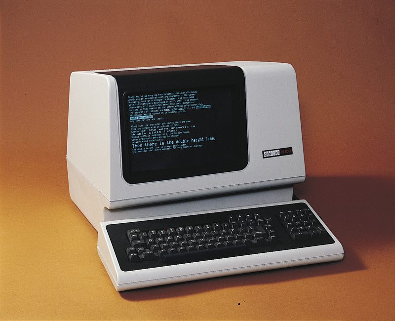
The VT100, introduced in 1978, was probably the single most popular and widely imitated VDT of all time. Most terminal emulators still default to VT100 mode.
Just as importantly, the existance of an accessible screen — a two-dimensional display of text that could be rapidly and reversibly modified — made it economical for software designers to deploy interfaces that could be described as visual rather than textual. The pioneering applications of this kind were computer games and text editors; close descendants of some of the earliest specimens, such as rogue(6), and vi(1), are still a live part of Unix tradition.
Screen video displays were not entirely novel, having appeared on minicomputers as early as the PDP-1 back in 1961. But until the move to VDTs attached via serial cables, each exceedingly expensive computer could support only one addressable display, on its console. Under those conditions it was difficult for any tradition of visual UI to develop; such interfaces were one-offs built only in the rare circumstances where entire computers could be at least temporarily devoted to serving a single user.
We took the the trouble to describe batch computing in some detail because in 2004 this style of user interface has been dead for sufficiently long that many programmers will have no real idea what it was like. But if some of the above seems nevertheless familiar, it may be be because many of the behavioral characteristics of batch systems are curiously echoed by a very modern technology, the World Wide Web. The reasons for this have lessons for UI designers.
JavaScript, Java, and Flash support limited kinds of real-time interactivity on web pages. But these mechanisms are fragile and not universally supported; the Common Gateway Interface — Web forms — remains the overwhelmingly most important way for web users to do two-way communication with websites. And a Web form fed to a CGI behaves much like the job cards of yesteryear.
As with old-style batch systems, Web forms deliver unpredictable turnaround time and cryptic error messages. The mechanisms for chaining forms are tricky and error-prone. Most importantly, web forms don't give users the real-time interactivity and graphical point-and-shoot interface model they have become used to in other contexts. Why is this?
Batch systems were an adaptation to the scarcity of computer clock cycles; the original computers had none to spare, so only a bare minimum went to impedance-matching with the brains of humans. Web forms are primitive for an equally good reason, but the controlling scarcity was one of network bandwidth. In the early 1990s when the Web was being designed, the cabling and switching fabric to support millions of real-time-interactive remote sessions spanning the planet did not exist. The deficit wasn't so much one of bandwidth (available bits per second of throughput) but of latency (expected turnaround time for a request/response).
The designers of CGI knew most of their users would be using connections with serious latency problems, on communications links that often dropped out without warning. So they didn't even try for real-time interactivity. Instead, the interaction model for the Web in general and web forms in particular is a discrete sequences of requests and responses, with no state retained by the server between them.
The batch-to-CGI correspondence is not perfect. The batch analog of dropped connections — permanent interruptions in the act of feeding cards into a machine, as opposed to just unpredictable delays — was relatively rare. And one of the reasons the CGI model is stateless on the server side is because retaining even small amounts of session state can be cost-prohibitive when you might have thousands or millions of users to deal with daily, not a problem batch systems ever had. Still, the analogy does help explain why the Web was not designed for real-time interactivity.
Today, in 2004, it is largely demand for the Web that has funded the build-out of the Internet to the point where massive real-time interactivity is thinkable as more than a pipe dream. We're still not there; latency and bandwidth constraints are still severe, as anyone who has watched the slow and stuttering progress of a video download can attest.
The lesson here is that the batch processing style is still adaptive when latency is large and unpredictable. We may almost solve that problem for the planetary Web in the next few decades, but there are fundamental physical reasons it cannot be banished entirely. The lightspeed limit is perhaps the most fundamental; it guarantees, among other things, that round-trip latency between points on the Earth's surface has a hard lower bound of a bit over a seventh of a second. [7] In practice, of course, switching and routing and computation add overhead. Nor would it be wise to assume that the Internet will forever remain limited to Earth's surface; indeed, satellite transmission has been handling a significant percentage of international traffic since the 1970s.
The command-line style has also persisted, for reasons we discussed in depth in [TAOUP]. It will sufficient to note here that the reasons for the survival of this style are not just technical constraints but the fact that there are large classes of problems for which textual, command-line interfaces are still better-suited than GUIs. One of the distinguishing traits of Unix programmers is that they have retained sophisticated styles of command-line design and already understand these reasons better than anyone outside the Unix tradition, so we will pass over pro-CLI arguments lightly in this book.
There is a subtler lesson to be drawn from these survivals. In software usability design, as in other kinds of engineering, it is seldom wise to dismiss an apparently clumsy or stupid design by assuming that the engineers of bygone days were idiots. Though engineers, being human, undeniably are idiots on occasion, it is far more likely in the normal course of events that a design you find ridiculous after the fact is actually an intelligent response to tradeoffs you have failed to understand.
There were sporadic experiments with what we would now call a graphical user interface as far back as 1962 and the pioneering SPACEWAR game on the PDP-1. The display on that machine was not just a character terminal, but a modified oscilloscope that could be made to support vector graphics. The SPACEWAR interface, though mainly using toggle switches, also featured the first crude trackballs, custom-built by the players themselves.[8]. ITen years later, in the early 1970s these experiments spawned the video-game industry, which actually began with an attempt to produce an arcade version of SPACEWAR.
The PDP-1 console display had been descended from the radar display tubes of World War II, twenty years earlier, reflecting the fact that some key pioneers of minicomputing at MIT's Lincoln Labs were former radar technicians. Across the continent in that same year of 1962, another former radar technician was beginning to blaze a different trail at Stanford Research Institute. His name was Doug Engelbart. He had been inspired by both his personal experiences with these very early graphical displays and by Vannevar Bush's seminal essay As We May Think [Bush], which had presented in 1945 a vision of what we would today call hypertext.
In December 1968, Engelbart and his team from SRI gave a 90-minute public demonstration of the first hypertext system, NLS/Augment.[9] The demonstration included the debut of the three-button mouse (Engelbart's invention), graphical displays with a multiple-window interface, hyperlinks, and on-screen video conferencing. This demo was a sensation with consequences that would reverberate through computer science for a quarter century, up to and including the invention of the World Wide Web in 1991.
So, as early as the 1960s it was already well understood that graphical presentation could make for a compelling user experience. Pointing devices equivalent to the mouse had already been invented, and many mainframes of the later 1960s had display capabilities comparable to those of the the PDP-1. One of your authors retains vivid memories of playing another very early video game in 1968, on the console of a Univac 1108 mainframe that would cost nearly forty-five million dollars if you could buy it today in 2004. But at $45M a throw, there were very few actual customers for interactive graphics. The custom hardware of the NLS/Augment system, while less expensive, was still prohibitive for general use. Even the PDP1, costing a hundred thousand dollars, was too expensive a machine on which to found a tradition of graphical programming.
Video games became mass-market devices earlier than computers because they ran hardwired programs on extremely cheap and simple processors. But on general-purpose computers, oscilloscope displays became an evolutionary dead end. The concept of using graphical, visual interfaces for normal interaction with a computer had to wait a few years and was actually ushered in by advanced graphics-capable versions of the serial-line character VDT in the late 1970s.
If full vector graphics and the custom hardware needed for systems like NLS/Augment was too expensive for general use, character VDTs were too crude. Today's nethack(6) game, run on a color terminal emulator or console, is well representative of the best that advanced VDTs of the late 1970s could do. They hinted at what was possible in visual-interface design, but proved inadequate themselves.
There were several reasons character VDTs came up short that bear on issues still relevant to today's UI designers. One problem was the absence of an input device that was well matched to the graphics display capability; several early attempts, such as light pens, graphic tablets, and even joysticks, proved unsatisfactory. Another was that it proved difficult to push enough bits per second over the line to do serious graphics. Even after VDTs acquired the capability to write pixels as well as formed characters, running GUIs on them remained impractical because serial lines had a peak throughput far too low to support frequent screen repainting.
For reasonable update speed, graphics displays really need to be coupled more closely to the machine that is doing the rendering than a serial connection will allow. This is especially true if one needs to support the kind of high interactivity and frequently changing displays characteristic of games or GUIs; for this, only direct memory access will do. Thus, the invention of the GUI had to wait until developments in silicon integrated circuits dropped the cost of computing power enough that a capable processor could be associated with each display, and the combination had become sufficiently inexpensive that machines could be dedicated to individuals' use.
The other missing piece was Engelbart's invention of the mouse — and, just as significantly, the visible mouse pointer. This more controllable inversion of the large, crude early trackballs meant that users could have a repertoire of two-dimensional input gestures to match the two-dimensional screen. It made interfaces based on direct visual manipulation of objects on-screen feasible for the first time.
Figure 2.4. The Xerox Alto.
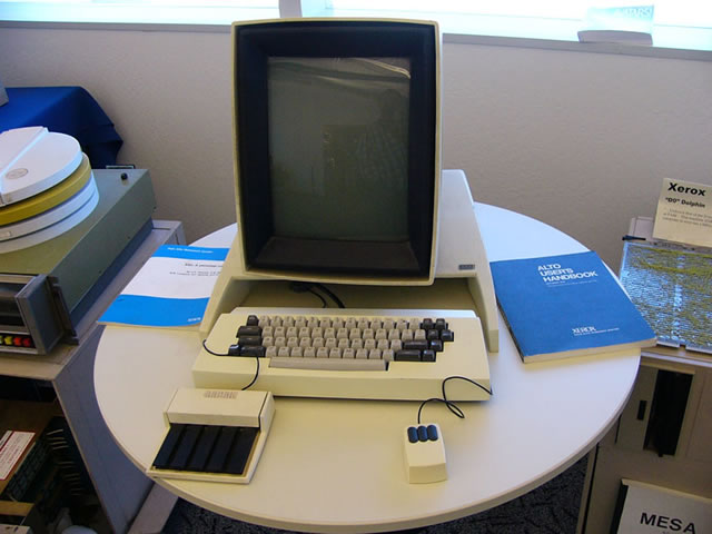
The input device on the left appears to be a touch tablet, a mouse alternative similar to the trackpads on modern portables.
NLS/Augment had shown what was possible, but the engineering tradition behind today's GUIs was born at the Xerox Palo Alto Research Center (PARC) around the same time character-cell VDTs were becoming generally available in the rest of the world. Inspired by Engelbart's 1968 demo, in 1973 the PARC researchers built a pioneering machine called the Alto that featured a bit-mapped display and a mouse. and was designed to be dedicated to the use of one person. It wasn't called either a “workstation” or a “personal computer”, but it was to become a direct ancestor of both. (At around the same time PARC gave birth to two other technologies that would grow in importance along with the GUI; the Ethernet and the laser printer.)
From today's post-Alto point of view, screen shots of the Alto UI show a curious mix of modernity and crudity. What's present are all the logical components of GUIs as we know them — icons, windows, scrollbars, sliders, and the like. The main GUI element missing, in fact, is the pull-down menu (introduced by the Apple Lisa in 1979). What's missing, most conspicuously, is color. Also, the pseudo-3D sculptural effects of modern GUI buttons and other impedimenta are missing; the widgets are flat outline boxes, and the whole resembles nothing so much as an etch-a-sketch drawing of a modern interface. It's a little sobering to reflect that most of what we have learned to add to GUIs since 1973 is eye candy.
It was not until the early 1980s that the implications of the PARC work would escape the laboratory and start to really transform human-computer interaction. There is no shortage of good accounts of that transformation, but most of them tend to focus on personal computers and the history of Apple, giving scant notice to the way the change interacted with and affected the Unix tradition. After 1990, however, and especially after 2000, the stories of Unix, the PC, and the GUI began to re-converge in ways that would have deeply surprised most of their early partisans. Today, a Unix-centered take on the history of user interfaces, even GUIs, turns out to be a much less parochial view than one might have supposed ten or even five years ago.
The entire story is a marvelous lesson for user-interface designers in how design innovation doesn't happen in a vacuum. UI design is no more separable than other forms of engineering and art from the accidents of history and the constraints of economics; understanding the complex and erratic way that we got where we are may be a real help to readers who want to think about their design problems not simply as exercises but as responses to human needs.
One skein of the story begins with the internal developments at Xerox PARC. The Alto begat the Dolphin, Dorado, Dandilion, Dragon, and Danditiger (an upgrade of the Dandilion). These “D-machines” were a series of increasingly powerful computers designed to exchange information over a prototype Ethernet. They had bitmapped displays and three-button mice. They featured a GUI built around overlapping windows, first implemented on the Alto as a workaround for the small size of its display. They had early connections to the ARPANET, the predecessor of the Internet.
These machines were tremendously influential. Word of them spread through the computer-science community, challenging other groups of designers to achieve similarly dramatic capabilities. Famously, in 1979 Steve Jobs was inspired to start the line of development that led to the Apple Macintosh after visiting PARC and seeing the Alto and D-machines in action there. Less often told is that Jobs had been pre-primed for his epiphany by Apple employee Jef Raskin, whose 1967 thesis had inspired some of the PARC research. Raskin had a keen interest in advanced UI design and wanted to find some of the PARC concepts a home at Apple so he could continue pursuing them.
One of the effects of the Alto was to popularize bit-mapped rather than vector-graphics displays. Most earlier graphics hardware had been designed to explicitly draw points, lines, arcs, and formed characters on a display, an approach which was relatively slow but economical because it required a minimum of expensive memory. The Alto approach was to hang the expense and drive each screen pixel from a unique location in a memory map. In this model almost all graphics operations could be implemented by copying blocks of data between locations in memory, a technique named BitBlt by its inventors at PARC. BitBlt simplified graphics programming enormously and played a vital role in making the Alto GUI feasible.
The very first commercialization of this technology seems to have been a machine called the Perq[10] aimed primarily at scientific laboratories. The Perq's dates are difficult to pin down, but an early sales brochure [11] seems to establish that these machines were already being sold in August 1979; other sources claim that due to production delays they first shipped in November 1980. The Perq design featured the same style of portrait-mode high resolution display as the Alto. It was quite a powerful machine for its time, using a microcoded bit-slice processor with a dedicated BitBlt instruction, and some Perqs remained in use as late as 2001. It supported at least five operating systems, including (later in the 1980s) at least three in the Unix family. Curiously, however, the designers seem to have discarded the mouse and retained only the touch tablet.
The inventors of Unix at Bell Labs were not slow to take notice of the Alto and its BitBlt technique. In 1981 they built a machine originally called the “Jerq”[12] and later renamed to “Blit” at management insistance. Like the Alto the Blit had a mouse, a bit-mapped screen, and a powerful local processor (in this case, a Motorola 68000). Unlike the Alto or Perq, it was designed to act as a smart terminal to a Unix minicomputer rather than for a network communicating directly with peer machines.
This difference in architecture reflected a basic difference in aims. While the PARC crew was free to reinvent the world, the Unix developers had history they were not interested in discarding. Plan 9, their successor to the Unix operating system, retained the ability to run most Unix code. The Blit, later commercialized at the AT&T 5620, was an amphibian — it could act as a conventional smart terminal, or it could download software from its host machine that would give it many of the GUI capabilities of an Alto or D-machine. Outside of Bell Labs and the special context of Plan 9 this amphibian was a solution that never found a problem, and the Unix community's first attempt at integrating a PARC-style interface sank into obscurity.
A few years later, however, Blit-like machines with local-area-network jacks and the character-terminal features discarded would rise again, as the X terminal.
That same year, in 1981, Xerox finally brought a machine based on the PARC technology to market. It was called the Xerox Star,[13] and it was a failure. Technically, it was woefully underpowered, slow, and overpriced. Hesitant and inept marketing did not help matters. Many of the developers, sensing more willingness from Apple and other emerging PC companies to push the technology, had started to bail out of PARC in 1980; the failure of the Star accelerated the process. Xerox, despite having pioneered the GUI and several of the other key technologies of modern computing, never turned a profit from them.
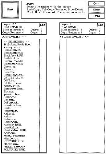
Figure 2.7. Screen shot from a Star (1981).
The Star interface pioneered the desktop metaphor that would be ubiquitous in later GUIs.
The third key event of 1981 was the first IBM personal computer. This did not advance the state of the art in GUIs — in fact, the original PC-1 had graphics capability available only as an extra-cost option, and no mouse. Its slow 8088 microprocessor could not have supported a PARC-style GUI even if the will and the design skill had been there to produce one. Even then, however, it was obvious that IBM's entry into the market would eventually change everything.
Earlier PCs from Altair, Apple and elsewhere had been even more underpowered and crude than the IBM PC. [14] The earliest, like the Altair, harked back to pre-1960 mainframes, requiring programs to be read from paper tape or toggled in on front-panel switches. The next milestone in the evolution of the GUI was actually to come out of the Unix world.
That next milestone was the 1982 release of the first Sun Microsystems computer, yet another mating of Unix with an Alto-inspired hardware design. This one, however, would prove immensely more successful than the Perq or Blit. In fact it set the pattern for one of the most successful product categories in the history of the computer industry — what became known within a few years as the technical workstation.
Workstations were Unix machines with high-resolution bit-mapped displays and built-in Ethernet. Early in the workstation era most were designed to use the Motorola 68000 and its successors; later on they tended to be built around various 32- and 64-bit processors at a time when PC hardware was still struggling to transition from 8 to 16. Workstations were designed (like the Alto) to be deployed as single-user machines on a local area network, but (again like the Alto) they were too expensive for individuals to own and were never marketed that way; instead they tended to be deployed in flocks, and the only way to get the use of one was to be a knowledge worker at a corporation or in academia. Three of their largest markets were software-development organizations, electronic design and CAD/CAM shops, and financial-services firms.
The Sun workstations and their imitators added very little to the GUI design pattern set at PARC; slightly glossier screen widgets with pseudo-beveled edges were nearly the extent of the visible additions. Their success came from layering the PARC look-and-feel over a software platform, Unix, that was already familiar to many engineers and development shops. Within five years the combination of GUI and command-line interfaces supported by workstations effectively wiped out traditional minicomputers and their staid command-line-only interfaces. It would be nearly a decade before Sun's machines were seriously challenged for their leading role in the computer industry.
All through that decade Suns remained very expensive machines. There were a few attempts to scale down the workstation to a price where it would compete with PCs for individual buyers; perhaps the least unsuccessful was the AT&T 3B1 (aka “Unix PC”), a 68010-based machine available c.1984 with a pixel-addressable black-and-white display running a custom Alto-like window system. The 3B1 attracted a small but loyal fan base as a personal machine for Unix programmers, but it was in an awkward spot on the price/performance curve; too expensive for the home market, not powerful enough to compete as a full-fledged workstation. It lasted barely three years before being plowed under by steadily more powerful PC-class machines with monitors that could not match the 3B1's screen resolution but could do color.
The 3B1's demise took the concept of the personal workstation down with it; nothing similar was ever attempted afterwards, and the initiative in Alto-style interfaces once again passed out of the Unix world. Thus, the really pivotal 1984 event in the history of the GUI was when Apple released the Macintosh and brought the Alto-style graphical user interface to the masses.
Perhaps it should have been the Amiga, designed in 1983 but released only after the Mac in 1985. The Amiga followed the PARC GUI model, if perhaps less inventively than the Macintosh. Its designers at the original Amiga Inc. wrung remarkably effective graphics performance out of weak hardware, and the machine rapidly attracted a cult following after release. But Commodore mismanaged and squandered the opportunity after they acquired the Amiga development team. Delayed and underfunded development, anemic marketing, over-expensive followon machines, bad strategic decisions and a bruising price war with Atari dogged the Amiga, but the technology was so attractive that it actually survived the IBM PC, the Macintosh, and the 1994 bankruptcy of Commodore. For nearly a decade afterwards the Amiga retained a niche in video mixing and production. The design was revived at least twice, and as late as 2003 German-made Amiga clones were still available in Europe.[15]
Figure 2.8. Kickstart on the Amiga 1000 (1985).
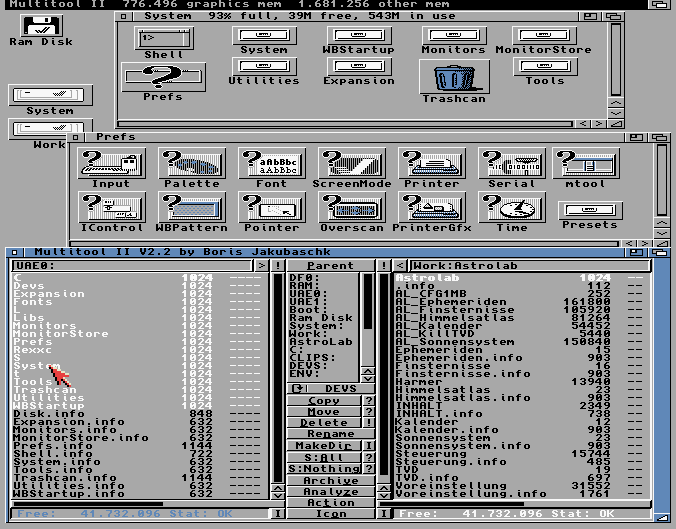
This is as good as the resolution of color monitors got in 1985 — no better than 640x256, not good enough to render fonts with the clarity of the black-and-white displays on the Star or Macintosh.
Apple did not squander its opportunity. Part of what made the first Macintosh a pivotal event was that Apple did not merely copy the PARC pattern; they reinvented and improved it. The development took five years, an eon by industry standards, and involved deeper investigation of interface psychology and design than anyone had ever attempted before. Apple successfully claimed the leading role in carrying forward the PARC-style GUI. Two decades later, the Apple Human Interface Guidelines[16] are still recommended reading for anyone who wants to do graphical user interfaces well.
Figure 2.9. Early version of the Macintosh Finder (1985).
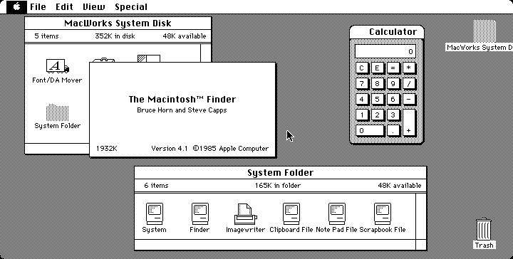
Compare this with the Amiga screenshot from the same year to see the dramatic difference between the quality of black and white vs. color displays in the 1980s..
Technically, the Amiga and Macintosh shared one major limitation with a subtle but important impact on UI design: unlike the PARC designs or any Unix machine, they supported only cooperative rather than preemptive multitasking. That is, they were not equipped to timeslice among any number of concurrent user and system processes; rather, a program had to give up control of the processor before any other program (even the system routines) could take over.
Cooperative multitasking was an economy measure. It meant the hardware platform could omit an expensive MMU (memory-management unit) from its parts list. On the other hand, it meant that the latency of interfaces was minimal and constant, never disturbed by random interrupts or scheduler-introduced jitter. This made for a smooth, predictable user experience even on relatively underpowered hardware. On the third hand, the absence of preemption turned into a serious liability as computers became more and more networked. It was literally the case that an entire network of Apple machines could be frozen by a user holding down a shift key at the wrong time!
Despite this weakness, the Macintosh had an even larger impact on user-interface design than had the Alto, because it was not dismissable as a mere laboratory toy but rather a very successful consumer product. GUIs, it proved, could sell computers to the mass market. Microsoft and others in the personal-computer market scrambled to adapt.
Microsoft's early attempts at a PARC-like GUI began with the 1985 release of Windows 1.0. Early versions were ugly and unsuccessful, garishly colorized but weak efforts to clone the PARC GUI that didn't support even such basic features as overlapping windows; they largely failed to displace Microsoft's own DOS product. Microsoft's time was not yet.
Once again the next genuine advance came from the Unix world, though its true significance would not be apparent for several years after the fact. That was the release of Version 10 of the X window system from MIT in 1986. The X design, begun in 1983 but not widely deployed until Version 10, accomplished three important things.
First, in 1987-1988 X established itself as the standard graphics engine for Unix machines, a hardware-independent neutral platform on top of which to build GUIs. This ended five years of confusion and dueling proprietary window systems that had badly fragmented the workstation market, making it uneconomical for most third-party vendors to port their applications. Significantly, X's major advantage over competitors for that role (most notably Sun's NeWS. Networked Window System) was being open source; it was backed by a consortium including most major Unix vendors. X thus prefigured the rise of open-source Unixes five years later.
Second, X supported distributing applications across a TCP/IP network. With X, a program could throw its interface on any networked display it could reach by sending requests to the X server attached to that display. The server, not the application, would then perform all the BitBlts necessary to put pixels on the memory-maped screen. This further decoupled Unix GUIs from the hardware.
Third, X separated policy from mechanism. It provided only generic graphics and event-handling, leaving the esthetic and policy issues in GUI design up to toolkit libraries or applications.
In fact, X represented the first fundamental advance in GUI infrastructure to achieve actual deployment since the days of the Alto itself. The Macintosh may have reinvented and improved the PARC GUI, but remained a monolithic system intimately tied to particular hardware — indeed, for many years the Mac GUI actually relied on patented ROMs and could not have run on machines without them as software only even if the Mac operating system had been ported. The Amiga GUI was similarly tied to specialized graphics chips included with the system. X reasserted the Unix tradition of portability and clean separation of functions.
Figure 2.11. OpenLook (c.1989).
Typical early X display on a Sun workstation. (This is actually a screenshot of a faithful emulation running under Linux.)
Despite its advances, X has attracted its share of brickbats over the years. Some parts of the design (including, for example, the resources feature) are notoriously complex and overengineered. The X APIs (application programming interfaces) are so baroque that toolkit libraries to simplify GUI programming are a stark necessity rather than merely a convenience. The design contains a lot of fossils and scar tissue related to odd and now-obsolescent graphics hardware.
The most serious indictment of X, however, is related to its separation of mechanism from policy. This has led to a huge proliferation of toolkit libraries and window managers. The Unix world, has, so far, been unable to settle on any one of these as as a stable unified standard for GUI look-and-feel. This is in stark contrast with other GUIs like the Alto's, Macintosh's or Amiga's, which wire in large parts of interface policy and thus make for a smoother and more uniform user experience than X provides.
Unix fans believe that over longer timescales the laissez-faire approach of X turns into an advantage. The argument is that policy ages faster than mechanism; X's flexibility helps it adopt new discoveries about UI while engines with more fixed policies gradually lose their appeal and relevance. Who, today, would buy the primitive etch-a-sketch look of the Alto GUI?
This debate is still live. The Linux community, at the forward edge of Unix, remains split between two major toolkits (GNOME and Qt). On the other hand, at time of writing in mid-2004 X is in the final stages of a successful architectural overhaul which gives it some dramatic new capabilities — without breaking compatibility with applications going clear back to the release of X11 in 1987!
One respect in which X10 was ahead of its time was in being among the first GUI engines (and the first widely-deployed one) to support color on a high-resolution display. In 1986 this was a engineering for a demand that barely existed yet; high-resolution color displays were rare and expensive hardware.
The mainstream acceptance of color displays was one of those pervasive technology adoptions that, like cellphones or video games, can become curiously difficult to remember the dates of even if one lived through it. After the fact, it seems like color displays have always been there. But, in fact, they did not become common on machines with the computing power to support a GUI until five years after the release of X10 — nearly twenty years after the original Alto.
More precisely, though monitors that were capable of both resolutions at or above 10,000 pixels and color began appearing on top-of-the-line workstations around the time of X10 in 1986, they remained too expensive for mass-market machines until around 1992. Early personal computers like the Apple II jumped one way, supporting command-line interfaces in low-resolution color on conventional TV displays. Machines positioned as “workstations” or high-end business machines jumped the other, following the Alto/Star lead to a custom-built high-resolution black-and-white display. But there were exceptions; the original Macintosh was black-and-white, because part of its charter was supporting word processing and WYSIWYG printing. And the original IBM PC tried to cover both markets by supporting a high-resolution green-screen monitor in their base system with an option for a low-resolution 16-color monitor.
Early Unix workstations running X opted for the black-and-white side of this fork, following the precedent set by serial-line VDTs and the Alto. But pressure to support color mounted steadily. Customers wondered, quite reasonably, why arcade video games and tiny 8-bit personal computers could throw a rainbow on the screen but much more sophisticated and expensive systems with mice and GUIs could not.
Next, Inc, a workstation manufacturer launched in 1988 by Apple cofounder Steve Jobs and others, marketed its designs around the promise of combining high resolution and color in a sytem that mated Macintosh-like UI polish with Unix power. But they moved a few years too soon; the technology to fulfil that promise at promised levels of price and quality was not quite ready. Limited-production prototypes attracted rave reviews and considerable loyalty from early adopters, but the hardware line was years late to market and not a success. Next exited the hardware business in 1993.
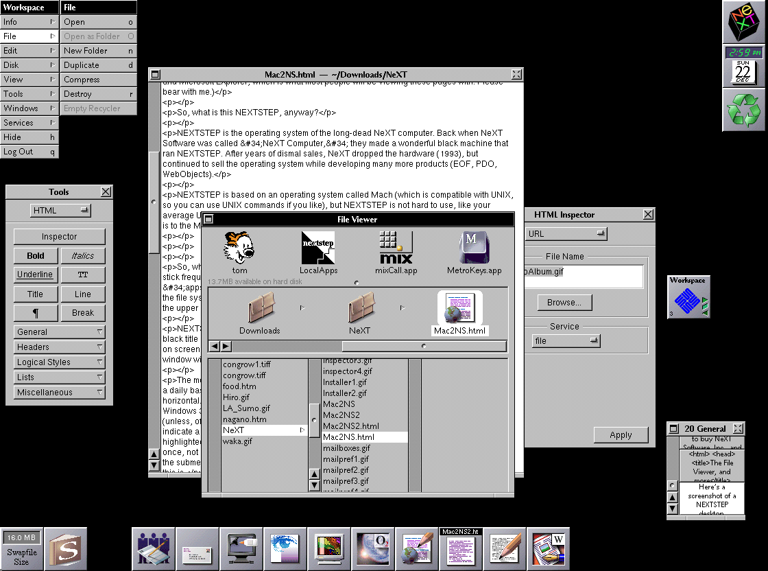
After 1989, PC and workstation vendors threw enough demand at the monitor manufacturers to buy a solution to this problem. Increasing standardization around the PC helped, and change came more rapidly the with the emergence of an entire tier of vendors producing commodity 386 machines. By 1991 high-resolution color had begun to appear on entry-level workstations and the newer 32-bit business machines, and it was obvious that continuing price trends would soon push it downwards into consumer PCs.
For a brief period in the early 1990s, even serial VDTs grew color capability in an effort to compete with networked PCs. The last gasp of the VDT industry was a tiny box called the Dorio with a PC keyboard and monitor connectors one one side and a serial port on the other, designed to turn commodity PC parts (manufactured with economies of scale the VDT vendors could no longer match) into a capable but inexpensive color VDT. The product was clever but doomed. Bit-mapped graphics, color, and direct-memory-mapped displays like the Altos won the day. With them, so did the GUI.
The long transition to color left GUI designers with the Rule of Optional Color: Don't convey critical information in color without also expressing it as shape, position, or shading. This is still good practice today, since slightly more than 10% of the population has one form or another of color blindness.
1987 was a significant year in yet another respect. That was when the 386, the first true 32-bit Intel chip, became generally available and opened up the possibility of Unix machines built with cheap commodity hardware. 32-bit PC hardware ate into the workstation and classical Unix-based minicomputer/server markets with increasing speed after 1990.
But the 32-bit Unix-capable PC affected GUI design surprisingly little over the next ten years. We have already noted its most important consequence in the widespread availability of high-resolution color displays. Elsewhere, the basic features of the PARC pattern remained stable. The Macintosh interface changed hardly at all. Unix GUIs retained their relatively severe, functional look. The GUI to benefit most from the new wave of 32-bit machines was that of Microsoft Windows.
As the 1980s drew to a close, Microsoft got the hang of emulating the Macintosh version of the PARC pattern more closely. But where Apple left most design decisions up to its skilled cadre of in-house interface experts, Microsoft focus-grouped new versions relentlessly. Thus, while Microsoft's designs were derivative and poorly integrated, they did a better job than Apple of providing the individual features that actual customers were asking for. Responsiveness to customer feedback, saturation marketing, and the steadily rising resolution of color screens would help make Windows 3.1 a huge success in 1992.
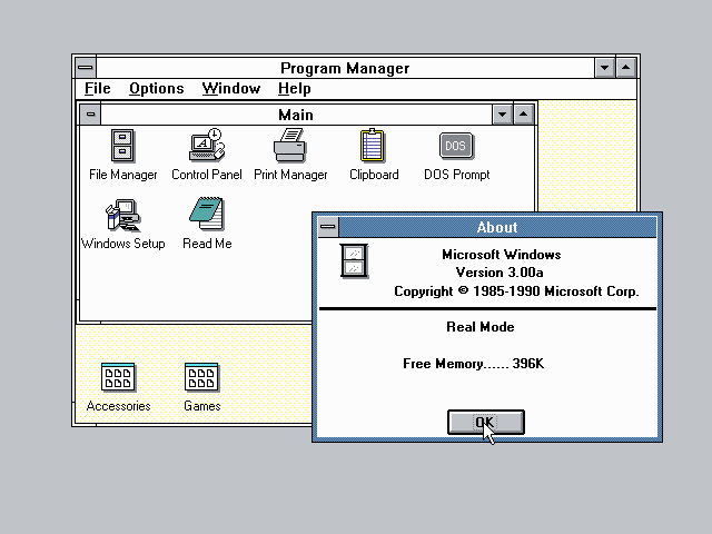
These were the critical years in which Microsoft cemented its desktop dominance and relegated Apple to niche markets. At least one lesson for today's GUI designers should be clear: never neglect the Rule of Reality! Apple's artistic vision of a clean, consistent, almost flawlessly integrated GUI lost over 90% market share to a design that was far messier and more contingent, but ruthlessly customer-focused.
In 1995, Windows 95 would be an even bigger success. It was dramatically more capable than 3.0/3.1, representing the largest increment of capabilities ever in a single Microsoft release.
Some points to note about the Windows 95 screenshot are the resizing thumb at the lower-right-hand corner of the Notepad window, the menu bar, and the presence of documents on the desktop background. These, which first appeared in Windows 95, are representative of many other borrowings from the Macintosh GUI.
If the triumph of Windows 95 was the perfect case study in the Rule of Reality, Microsoft's one serious attempt to actually innovate in GUI design became an equally salutary lesson in the consequence of ignoring the Rule of Respect. That attempt was Microsoft Bob, a suite of eight programs intended to sit atop Windows 95 and modulate its UI into something more “user-friendly”.
The theory behind Bob was to replace the specialized metaphors of the PARC-style desktop with a pseudo-spatial virtual reality in which programs and documents were represented by familiar, everyday objects. The crude graphics of the home screen are an instant clue to what went wrong; in practice, Bob was a cartoonish, cloying interface populated by “Personal Guides” whose saccharine pseudo-friendliness failed to mask extreme mechanical stupidity.
Microsoft Bob became the worst flop in Microsoft's history, a debacle so embarrassing that the company destroyed all copies of the software it could get its hands on and attempted to erase the entire episode from the public record. The only “Bob” novelty to survive its demise was none other than Clippy, the painfully distracting “assistant” in Microsoft Word. Despite repeated later paeans to “innovation”, Microsoft has never since attempted any advance in GUI design that went deeper than improved eye candy. Once again, the next steps forward came out of the Unix world.
After 1995 the Unix tradition responded in two different ways to the rise of Microsoft Windows; both responses affected GUI design by tending to decouple GUIs from the underlying hardware, breaking up the layers as X had begun to do in the 1980s. One of these responses, the Java language, was essentially proprietary; the other was the rise of the open-source movement.
Java, by Sun Microsystems, was an attempt to produce a language in which you could “write once, run anywhere”. The explicit goal of Java was for applications to be able to run identically under Unix, Windows, the Macintosh OS, and everywhere else — and it was clearly understood that the biggest portability problem was making GUIs work identically on all these platforms. X had only solved the lower half of this problem, and then only on Unix systems; the designers of Java were more ambitious.
Towards that ambition, the Java interpreter carries its own GUI environment with it — not just a rendering engine analogous to that in the X server, but an entire toolkit and higher-level facilities as well. The inventors of Java, steeped in Unix tradition, essentially crammed an entire Unix-style GUI stack (two of them, actually!) into Java as the Swing and AWT toolkits. The visible part of these GUI stacks supports an Alto-style interface differing in visual detail from that of earlier Unix-based efforts, but with essentially the same capabilities and programming model.
Java left the underlying operating system in place, but tried to render it effectively irrelevant. The other and more radical Unix-tradition response was to reinvent the operating system itself as shared infrastructure.
Even as 32-bit PCs all but destroyed the workstation market that Unix-family operating systems had depended on, the new hardware also revealed the increasing inadequacy of single-user personal-computer operating systems. Their most important flaw was architectures too weak to support networking effectively, a job which (as we discussed in [TAOUP]) requires a combination of features including preemptive multitasking and full multi-user capability with per-user security domains.
Before 1990, lack of these features had been the fatal flaw that laid low most of Unix's competition in the mainframe and minicomputer worlds. After the Internet-access explosion of 1993-1994, these same weaknesses rapidly became a serious problem for the winners of the personal-computer OS wars at Microsoft and Apple. But traditional Unix vendors were uninterested in building low-margin consumer systems. They ignored or fumbled the Internet opportunity, and it was met by the rise of the open-source movement among Internet and Unix developers themselves. The flagship product of that movement was the Linux operating system.
The 1996-1998 emergence of the open-source movement into public view shook up the computer industry as nothing had in the previous decade. The evolution of user interfaces was affected, along with everything else. Four particular events during those three years well expressed the trend:
The rapid eclipse of proprietary X toolkits (notably Motif) by the open-source GTK and Qt toolkits.
The launching of the GNOME and KDE projects to create Linux GUIs.
The embrace of open-source development by Andy Hertzfeld and other leading developers of the Macintosh interface.
Apple's adoption of an open-source Unix as the foundation of Mac OS X.
The last two items, in particular, pointed at two different ways to reconcile the Unix community with the PARC/Macintosh mainstream of the GUI tradition. Ever since the first Sun workstations in 1982 the Unix community had tended to lag the Macintosh community by as much as five years in the visible parts of UI design, but to lead in building the infrastructure that would best support GUIs in an Internetted world. Open-source Unixes helped draw the world's most accomplished GUI designers into the new Unix community at the same time as Apple was co-opting the work of that community to carry the Macintosh lineage forward.
In these and other ways, the Unix and Macintosh traditions are beginning to merge. Several levels of the Unix GUI stack, from the X server clear up to specific widely-used applications like the open-source Nautilus file browser, are undergoing rapid (and sometimes controversial[17]) evolutionary change as this happens. Their only serious competion, the GUI of Windows, is much more constrained by history and Microsoft's institutional needs; in the wake of the Microsoft Bob debacle it is no surprise that Microsoft's tendency to cherry-pick individual design features from elsewhere, rather than innovating in broad ways, has become more marked.
The rise of GTK and Qt highlights another tendency. Increasingly, user-interface design tools are showing the same tendency to become shared infrastructure that we have previously seen in operating systems and networking. Already in 2004 there is no company other than Microsoft that could even conceivably buck this trend, and even Microsoft's next-generation .NET development tools are mirrored by the Microsoft-endorsed “Mono” open-source project.
The GUI environment around Sun's Java language is being similarly challenged by the open-source Eclipse project. It seems increasingly likely that Java itself will soon slip from Sun's control, whether because Sun opens the sources of its JRE (Java reference implementation) or because some competing Java-standard-compliant open-source implementation eclipses the JRE.
We won't attempt to cover Java or Eclipse in the remainder of this book, at least not in the first edition. Java has an entire voluminous literature of its own; we recommend Eckel as a starting point for the interested programmer. Within the Unix world, Java has so far taken both a technical and political second place to combinations of various scripting languages and the GTK or Qt toolkits. It is possible this may change in the next few years if an open-sourced Java overtakes the likes of Tcl, Perl, and Python in Unix developer mindshare. If that happens, future revisions of this book will reflect the new reality.
Since the earliest PARC systems in the 1970s, the design of GUIs has been almost completely dominated by what has come to be called the WIMP (Windows, Icons, Mice, Pointer) model pioneered by the Alto. Considering the immense changes is in computing and display hardware over the ensuing decades, it has proven surprisingly difficult to think beyond the WIMP.
A few attempts have been made. Perhaps the boldest is in VR (virtual reality) interfaces, in which users move around and gesture within immersive graphical 3-D environments. VR has attracted a large research community since the mid-1980s. While the computing power to support these is no longer expensive, the physical display devices still price VR out of general use in 2004. A more fundamental problem, familiar for many years to designers of flight simulators, is the way VR can confuse the human proprioceptive system; VR motion at even moderate speeds can induce dizziness and nausea as the brain tries to reconcile the visual simulation of motion with the inner ear's report of the body's real-world motions.
Jef Raskin's THE project (The Humane Environment) is exploring the “zoom world” model of GUIs, described in [Raskin] that spatializes them without going 3D. In THI the screen becomes a window on a 2-D virtual world where data and programs are organized by spatial locality. Objects in the world can be presented at several levels of detail depending on one's height above the reference plane, and the most besic selection operation is to zoom in and land on them.[18]
The Lifestreams project at Yale University goes in a completely opposite direction, actually de-spatializing the GUI. The user's documents are presented as a kind of world-line or temporal stream which is organized by modification date and can be filtered in various ways.
All three of these approaches discard conventional filesystems in favor of a context that tries to avoid naming things and using names as the main form of reference. This makes them difficult to match with the filesystems and hierarchical namespaces of Unix's architecture, which seems to be one of its most enduring and effective features. Nevertheless, it is possible that one of these early experiments may yet prove as seminal as Engelbart's 1968 demo of NLS/Augment.
[6] We are aware of the disputes surrounding the invention of the digital computer and the varying claims to priority of machines like the Atanasoff-Berry Computer, the Zuse machines, and the Colossus. For our purposes in this book, these disputes are irrelevant; the standard account that identifies the birth of the digital computer with the foundation of a continuous engineering tradition of Turing-complete digital computers by the designers of the Harvard Mark I in 1939 and the ENIAC in 1945 is satisfactory.
[7] A light-second is just shy of 300,000 kilometers (precisely, 299792.453684314). The circumference of the Earth is a hair over 40,000 kilometers (precisely, 40,076). Halve the Earth's circumference for the length of the optimal path between antipodal points; double it because we're talking about a round trip. Optimistically assume that switching and routing add no latency. The hard lower bound is then 0.133 seconds, which is by coincidence just about the minimum response time of a human reflex arc.
[8] A more detailed description of the SPACEWAR interface is available on the Web. An excellent history of SPACEWAR's impact on the large computing scene was a 1972 Rolling Stone by counterculture guru Stewart Brand; it is available on the Web. The authors of Spacewar wrote a detailed account of the design process for Creative Computing magazine in 1981; it too is available on the Web.
[10] A good description can be found at the Bletchley Park Computer Museum in England; though produced in Pittsburgh, the Perq was apparently most successful at British universities.
[12] The story of the name change is humorously told in the AT&T 5620 (and Related Terminals) Frequently Asked Questions document, from which the Blit-Related material in this history is largely derived.
[13] A discussion of the Xerox Star explaining some of its design choices is available as The Xerox "Star": A Retrospective.
[14] For an entertaining look at early personal computers, see the Blinkenlights Archeological Institute
[15] There is a good resource on the history of the Amiga at The Amiga History Guide
[17] As an example of such controversy, at time of writing there is much debate over a novel “spatial” model of browsing implemented in Nautilus. Whether or not this particular controversy is resolved for the new way or the old is perhaps less important than the fact that Nautilus development is open to basic rethinking of the UI model at all.
[18] Open-source THE software is available on the Web.
Table of Contents
GUI fragmentation is the greatest competitive weakness of Unix.
-- The Unix GUI ManifestoThis chapter will explain how the Unix GUI stack fits together. By the time you are finished reading it, you will understand how Unix programs, libraries, and system services cooperate to throw graphics and text on a screen and handle input events. You will be aware of the major alternatives at each level of the stack, and be prepared to learn any of the specific APIs needed to use them. You will also have some knowledge of the sorts of construction tools that are available to automate GUI coding.
The Unix GUI stack obeys Unix design principles by being constructed as a set of layers or modules connected by documented APIs, and designed so that each piece can be swapped out for alternate implementations. This gives the whole system a great degree of flexibility and robustnness, though at the cost of making it difficult to guarantee a consistent user experience.
The base of the stack, is, of course, hardware. In 2004 Unix systems typically feature the following devices relevant to GUI programming:
- A pixel-addressible color monitor with 1024x768 or higher resolution.
- A graphics card supplying hardware support for 2D operations such as BitBlt, and possibly 3D applications such as texture mapping.
- A three-button mouse or trackball.
- A keyboard.
- A sound card, usually capable of 16-bit stereo at 44MHz or better sampling rate, with associated speakers.
Improvements in this hardware are still happening at time of writing, but the pace is slowing as their enabling technologies mature and the cost of each increment in capability rises. High-end graphics cards are approaching the limit of about 80,000 polygons per second at which they will be able to refresh with more speed and higher resolutions than the human eye can follow; we can expect that to happen about 2006-2007. The changeover from electron-gun monitors to liquid-crystal flatscreens is actually slowing the rise in screen resolutions, as large LCDs are even more prone to manufacturing defects than phosphor masks. Mice and keyboards are stable, old, and thoroughly commoditized technology; the largest recent change there has been a revival of trackballs in elegant thumb-operated versions that have better ergonomics than mice but are functionally identical to them.
Sitting atop the hardware will be an X server. The X server's job is to manage access to all the underlying hardware listed above, except for the sound card which is handled by a different mechanism which we'll specify further on.
The X server accepts TCP/IP connections from GUI applications. Those applications will read that connection to get input events, which include both keyboard presses and releases, mouse-button presses and releases, and mouse motion notifications. The applications will write requests to the TCP/IP connection for the server to change pixels on the display in various ways. There is a standard X protocol specifying how requests and responses are structured.
Each X application makes calls to a linked copy of a service library that handles the application end of the X protocol connection to the server. The raw API of this library is notoriously complex and only describes low-level services, so typically the application actually calls it through a second library called a toolkit.
The function of the toolkit library is to provide higher-level services and the basics of an interface policy. There are several tookit libraries, which we'll survey later in this chapter. The services each one provides are typically organized as a collection of widgets such as buttons, scrollbars, and canvas areas that can be drawn on. An interface policy is a set of rules (or at least defaults) about how the widgets behave — a “look and feel”.
Toolkit libraries are written in C. If the application is as well, it will call the toolkit directly. In the increasingly common case that the application is written in a scripting language such as Tcl, Perl or Python, the application will call the toolkit library through a language binding which translates between the language's native data objects and the C data types understood by the toolkit.
The application itself will, after initial setup, go into an event loop. The loop will accept input event notifications from the server, dispatch the input events to be handled by application logic, and ship requests for screen updates back to the server.
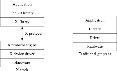
This layered organization contrasts sharply with the way things are done on non-Unix systems. Elsewhere, the graphics engine and toolkit layer are combined into a single service, and the GUI environment layer is at best semi-separable from either. This has two practical consequences. First, GUI applications must run on the same machine that hosts their display. Second, attempts to change the interface look-and-feel risk destabilizing the graphics engine code.
There are actually two layers within a running X server itself: a device-dependent display driver and a device-independent protocol engine. On startup, the X server determines which device driver to load by looking at its configuration file. Thereafter, from the point of view of anything above the X server in the stack, the display driver is almost invisible; all it does is supply a small set of calls that manipulate the display bitmap.
The X library linked to the client, Xlib, abstracts away the presence of the X protocol connection to the server and the individual characteristics of the underlying hardware. From the point of view of any program calling the client X library, the hardware is represented by a C structure called a graphics context; library operations manipulate that context, and there is an update call that tells the library to ship back to the X server the operations necessary to make the physical screen state match that of the graphics context. (Some library operations also finish by forcing an update.)
The X design uses several tricks to cut latency in screen updates. One is the Shared Memory Extension: if application and X server are running on the same hardware, X detects this and they communicate using a shared-memory mailbox, bypassing the TCP/IP stack entirely. Another is that the X protocol design is contrary to the normal Unix practice of loose, textual application protocols optimized for debuggability; instead, it uses a tightly-packed binary protocol to reduce datagram sizes per transaction to a bare minimum. Finally, the X server also bypasses the operating-system kernel; at startup time it requests access to I/O ports that go direct to the graphics card's video RAM, rather than using the Unix read/write. system calls. Thus, X avoids context-switching on every update.
The Xlib API is unpleasantly complex (less charitable but not infrequent descriptions run along the lines of “a baroque nightmare”). There are entire geological strata inside it full of fossils of optimization hacks that made sense in an environment of expensive RAM and slow hardware but are no longer necessary. For example, many of the Xlib calls are duplicated in clipped and unclipped variants, a leftover from days when clipping was an expensive software operation rather than a standard feature of graphics-card firmware.
Other complexities address problems that are still live but have better solutions independent of X than existed when the X design was laid down in the 1980s. Representative of these are the X security and access-control features. Under modern Unixes this notoriously messy and poorly-documented part of the system has been largely superseded by tunnelling the X protocol through ssh(1), the Secure Shell. ssh(1), an open-source tool for encrypting network connections. ssh(1)specializes in encryption and access control, and is easier to configure and administer than the native X features.
A few of the nasty spots are complex and unsatisfactory solutions to problems for which nobody has yet devised simpler and more satisfactory ones. Prominent among these is the X resource system. This allows users of X applications to set up name/property pairs which the X server digests and can use to alter the behavior of the applications running on it, (Common per-application resources include, for example, foreground and background colors for screen displays.) The problem with the resource system is that the server can collect name/value pairs from so many different sources that it is often difficult to tell where a given setting came from or what the effect of changing it will be. Modern practice tends to avoid using the resource facility entirely in favor of specialized per-application configuration files.
Despite these flaws, X has had no serious challenger for the role of Unix graphics engine in the last decade. A handful of attempts, such as the Fresco project (originally the “Berlin” project) have come to nothing. The Aqua libraries layered over the Unix Foundation of Mac OS X are X's only functional competition — but as single-vendor proprietary code they are a non-starter anywhere but on Apple machines, and can never expect to attract X's volume of cross-platform developer support. In recognition of this fact, Apple has added an X server compatibility feature to Aqua so that “legacy” X applications can run under it.
After several years of political and technical stagnation during which many Unix insiders worried that the codebase might have aged and complexified beyond salvage, X server development is undergoing something of a renaissance at time of writing in 2004. A new rendering engine based on Porter-Duff composition rather than the traditional BitBlt has been successfully implemented, and has been used to demonstrate dramatic new capabilities which should soon make their way into production versions.
The most visually obvious of these is full alpha-channel support. This means that upcoming X servers will make it easy for toolkit libraries to stack transparent and partially-transparent widgets on the screen, with lower layers correctly blending with the layers above them. This feature will make X fully competitive with Aqua, which has used alpha transparency to beautiful effect on recent Macintoshes.
Just as importantly, though less visibly, the re-architecting of the X server carries the original X concept a step forward by breaking the X server into communicating pieces. Image-composition logic will be separated from the server core that drives the graphics hardware. The next generation of X servers will be both more capable and less complex than today's, while still retaining backward compatibility with the X application base.
Most GUI developers will never have to see or cope with the legendary intricacies of Xlib. As we noted earlier in the overview, the X server's features are normally encapsulated by toolkit libraries and language bindings of those libraries.
Your choice of X toolkit will be connected to your choice of language bindings in two ways: first, because some languages ship with a binding to a preferred toolkit, and second because some toolkits only have bindings to a limited set of development languages.
The once-ubiquitous Motif toolkit is effectively dead for new development. It couldn't keep up with the newer toolkits distributed without license fees or restrictions. These attracted more developer effort until they surged past closed-source toolkits in capability and features; nowadays, the competition is all in open source.
The original open-source X toolkit is also moribund. The Xaw library, often known as the Athena toolkit after the MIT research project that spawned X, was written in the mid-1980s as a testbed for the server's features. It supported crude line-drawn widgets resembling those of the original 1973 Alto GUI. We mention it here mainly because you will occasionally run across references to it in the X documentation, but there is no new development in it.
The four toolkits to consider seriously in 2004 are Tk, GTK, Qt, and wxWidgets[19], with GTK and Qt being the clear front runners. All four have ports on MacOS and Windows, so any choice will give you the capability to do cross-platform development.
The Tk toolkit is the oldest of the four and has the advantage of incumbency; it's native in Tcl and bindings to it are shipped with the stock version of Python. Libraries to provide language bindings to Tk are generally available for C and C++. Unfortunately, Tk also shows its age in that its standard widget set is both limited and rather ugly. On the other hand, the Tk Canvas widget has capabilities that other toolkits still match only with difficulty.
GTK began life as a replacement for Motif, and was invented to support the GIMP. It is now the preferred toolkit of the GNOME project and is used by hundreds of GNOME applications. The native API is C; bindings are available for C++, Perl, and Python, but do not ship with the stock language distributions. It's the only one of these four with a native C binding.
Qt is a toolkit associated with the KDE project. It is natively a C++ library; bindings are available for Python and Perl but do not ship with the stock interpreters. Qt has a reputation for having the best-designed and most expressive API of these four, but adoption was initially hindered by controversy over early versions of the Qt license and was further slowed down by the fact that a C binding was slow in coming.
wxWidgets is also natively C++ with bindings available in Perl and Python. The wxWidgets developers emphasize their support for cross-platform development heavily and appear to regard it as the main selling point of the toolkit. Another selling point is that wxWidgets is actually a wrapper around the native (GTK, Windows, and MacOS 9) widgets on each platform, so applications written using it retain a native look and feel.
As of mid-2004 few detailed comparisons have been written, but a Web search for “X toolkit comparison” may turn up some useful hits. Table 3.1, “Summary of X Toolkits.” summarizes the state of play.
Table 3.1. Summary of X Toolkits.
| Toolkit | Native language | Shipped with | Bindings | ||||
|---|---|---|---|---|---|---|---|
| C | C++ | Perl | Tcl | Python | |||
| Tk | Tcl | Tcl, Python | Y | Y | Y | Y | Y |
| GTK | C | Gnome | Y | Y | Y | Y | Y |
| Qt | C++ | KDE | Y | Y | Y | Y | Y |
| wxWidgets | C++ | — | — | Y | Y | Y | Y |
Architecturally, these libraries are all written at about the same abstraction level. GTK and Qt use a slot-and-signal apparatus for event-handling so similar that ports between them have been reported to be almost trivial. Your choice among them will probably be conditioned more by the availability of bindings to your chosen development language than anything else.
GUIs depend on more than just a graphics toolkit. They need a framework, an integrating environment to help them communicate with one another and the rest of Unix. Because GUI environments normally aim at supporting some variant of the virtual desktop metaphor pioneered by the Alto, they are often referred to as “desktop environments” or just “desktops”. Among the things such a desktop environment typically supplies are the following:
The default behavior of your toolkit library will supply part of your interface's look-and-feel choices, but most of them will come from the policy set by your GUI environment. Where toolkits supply simple widgets like buttons, text-entry boxes, and scrollbars, GUI environments combine these to produce compound widgets with a consistent look and feel — scrolling menus, combo boxes, menu bars, progress indicators, and the like.
A window manager is the GUI analog of a shell. Though the term “window manager” is traditional, these programs might better be called “interface managers”. They handle mouse clicks on the screen background, supply frames with maximize/minimize/dismiss (and possibly other) buttons for windows, support moving and resizing windows, support launching and dismissing applications, and provide a hosting environment for specialized application launchers like toolbars or docks.
Modern window managers are usually associated with one or another of the two major toolkits, GTK or Qt, though a few of the older ones use the Athena widget set or go to Xlib directly. Modern window managers are also usually themable, which means their visual appearance can be varied by supplying a resource file of widget decorations and colors. Changing themes does not change the logic of the window manager controls.
We won't go into great detail about different window managers here because nothing about them tends to have much impact on writing application GUIs. A brief survey of the alternatives available other Linux and other modern Unixes in mid-2004 follows: for a more in-depth look at these and others, including screenshots, see the excellent Window Managers For X website.
- kwm
Uses Qt. Themable. This is the window manager shipped with the KDE desktop environment, and is very tightly integrated with it.
- sawfish
Uses GTK. Themable. This is the default window manager shipped with GNOME.
- WindowMaker
Uses Athena widgets. Themable. Tries to capture the look and feel of the old NextStep workstations, a fondly remembered series of Unix machines from the late 1980s.
- Enlightenment
Uses GTK. Themable. This was at one time the default window manager shipped with GNOME, untill they switched to Sawmill/Sawfish. The author is a visual artist and Enlightenment features particularly elaborate eye candy.
- metacity
- BlackBox
Can use Qt or Motif. Its major selling point is that it has a very small memory footprint; it tends to be valued by people who want a modern but minimalist approach in their window manager.
- twm
This window manager is mainly of historical interest and is listed here mainly because some pieces of X documentation refer to it; it is no longer actively maintained. It used to ship with X, and before the post-1996 Unix renaissance was for many years the leading edge in window managers, but is very spare and feature-poor by today's standards. The OpenLook screenshot in the history chapter appears to have been made on a system using twm. There are a couple of minor variants, including vtwm, tvtwm and ctwm; some of these are still maintained.
- fvwm2
Uses Xlib; can optionally use GTK. Themable. fvwm2 is a modern descendant of twm, and is intended to carry forward the twm tradition of a very simple desktop with programmer-oriented configuration while also adding a few modern flourishes such as themability.
Users expect to be able, at a minimum, to be able to use the mouse to copy or cut text from one application window and paste it into another. GUI environments normally provide some sort of simplified interface to ICCCM, the protocol documented in the X11 Inter-Client Communication Conventions Manual, to enable applications to handle cut and paste properly.
ICCCM also allows applications to post hints to a window manager about the preferred locations, sizes, stacking behavior, and other properties of their windows. GUI environments provide consistent defaults for these hints and (often) easier ways to post them than bare Xlib supports.
More advanced GUI environments support drag and drop of files and icons into and between applications, with the application performing some customized action on the payload. ICCCM alone will not enable this; it requires something like an object-broker daemon running in background, and a GUI-environment-specific notification protocol that tells applications when they need to query the daemon. Much of this complexity, including the interface to the object broker, is normally abstracted away by service libraries shipped with the GUI environment.
Since there is only one sound card per machine but multiple applications may contend for use of it, access to the sound card needs to be either serialized or mixed. This is normally handled by a sound daemon shipped with the GUI environment, with applications sending requests to the daemon through yet another service library.
The libraries shipped with GUI environments often include other kinds of services for application programming that are not strictly related to GUI support. They may supply a lightweight database facility, for example, or code for parsing and reading a generic configuration-file format, or support for internationalization via message catalogs.
When GUI environments get into functionality arms races with each other, this is one of the places where the consequences often show up. Some call these additional services features, some call them bloat, and the arguments over which are which frequently degenerate into religious wars. You have been warned!
Which GUI environment you choose to host your application is one of the most important background decisions you will make about it. The decision will have significant technical consequences, because although the features offered by different desktops are broadly similar they are by no means identical. The decision will also control which other applications you can most easily integrate yours with. Finally, the decision will have political consequences as well, because both of the major desktops have vociferous advocates, associated communities of interest, and major corporate backers.
To understand why choice of desktop is such a sensitive issue, a little review of the history of major Unix desktop environments is in order. Excluding one or two that have been obsolete for so long that they have no influence on present-day conditions, there have been four: NeXTstep, CDE, KDE, and GNOME.
NExTstep was the proprietary GUI environment associated with Next, whose premature attempt to build inexpensive color workstations we touched on in the History chapter. In 1993 NeXT went software-only to concentrate on developing and licensing NeXTstep, and successfully closed a licensing deal with Sun Microsystems. In 1997 Apple bought out Next in order to fold its software technology into the next-generation Macintosh operating system; that technology became a substantial part of Mac OS X. A screenshot of a NeXTstep desktop was included in the History chapter.
While NeXTstep itself was proprietary, attempts to build emulations of its look and feel have attracted persistent minority support in the post-1997 open source community. We have already touched on two of these, the AfterStep and WindowMaker window managers. There is a GNUStep project attempting to implement Apple's published standard interfaces for NeXTstep, but there is no realistic prospect that it will overtake GNOME or KDE in the struggle for developer mindshare. Nevertheless, NeXTstep continues to serve as a design model for the more widely used present-day desktops.
CDE, the Common Desktop Environment, was an attempt to do for desktops what the X window system had done for the underlying graphics engine. It was develped by a consortium of proprietary Unix vendors including IBM, Hewlett-Packard, and Sun Microsystems and built around the proprietary Motif toolkit. CDE successfully replaced a gaggle of single-vendor proprietary desktops in the early 1990s. But like Motif, CDE proved unable to keep up with open-source competitors after 1997 and has since been abandoned by its former patrons.
KDE, Kool Desktop Environment, began life in 1996 as an attempt to produce an open-source equivalent of CDE for Linux. Ther primary motivation of the developers was evangelistic, to build a GUI that would take Linux to end-users. Accordingly the aims of KDE almost immediately enlarged from just producing a desktop to shipping an entire application suite including a Web browser, word processor, spreadsheet, and other productivity tools.
While the KDE developers made rapid early strides towards their technical goals, they also made a serious political mistake. The Qt toolkit on which they based their desktop was under a license that did not completely conform to the developing norms of the open-source community. This led to a heated controversy, with opponents expressing concern that that Trolltech, the small Norwegian consulting company behind Qt, might eventually use its control of the code in damaging ways.
Trolltech eventually cbanged its license to be fully conformant with community norms. But by that time, the damage had been done. The GNOME project was founded in 1997 as an explicit rival of KDE. To the chagrin of the KDE hackers, it marketed itself more effectively than KDE had done and swiftly attracted a larger developer community. KDE's situation was not helped by the fact that its core group was located in Germany rather than the United States, and accordingly found it somewhat more difficult to recruit a large talent base.
Like KDE, GNOME quickly expanded its mission to supporting an entire application suite. The two projects settled into intense and sometimes bitter rivalry, occasionally punctuated by cooperation on technical standards such as drag-and-drop protocols. The arms race between them has probably stimulated greater code productivity by both teams, but has done so at the cost of dividing the developer community and the open-source applications space.
This situation is probably not stable, especially not given that in early 2004 a single corporate entity (Novell) acquired the two companies most responsible for funding KDE and GNOME development respectively. But it is at time of writing too early to tell whether the split will be resolved by the disintegration of one project or the merger of both.
We cannot tell you which environment is “best”, as the development of both moves so quickly that anything we were to say about relative capabilities would be likely to have changed by the time you read this. There will be, alas, no substitute for doing your own evaluation.
Each of the three different major interface styles we have described (batch, command-line, and GUI) implies a characteristic kind of control flow in the applications that use them.
Batch programs, for example, lived in a timeless world where they read from input sources and write to output sinks without having to worry about timing, synchronization, or concurrency issues; all those problems were the responsibility of human operators.
The basic control flow of command-line programs, on the other hand, is a request-response loop on a single device. When a Unix CLI is running on a terminal or terminal emulator, it can assume it has undisputed control of that device. Furthermore, there is only one kind of input event; an incoming keystroke. So the program can enter a loop that repeatedly waits for input of a single kind on a single device, processes it, and writes output to single device without concerns about whether that device is available. The fact that such programs sometimes have to poll storage or network devices at odd times does not change this basic picture.
Programs with GUIs live in a more complex world. To start with, there are more kinds of input events. The obvious ones are key presses and releases, mouse-button presses and releases, and mouse movement notifications. But the context of a window system implies other kinds as well: expose events, for example, notify a program when a window needs to be be drawn or redrawn because that window (or some part of it) has gone from being obscured to being visible. Further, GUIs may have more than one window open at a time, so events tied to a window cannot be simple atoms but have to include a detail field containing a window index.
What will follow next, then, is an overview of the X programming model. Toolkits may simplify it in various ways (say, by merging event types, or abstracting away the event-reading loop in various ways), but knowing what is going on behind the toolkit calls will help you understand any toolkit API better.
X applications are clients of the X server that is managing their display. They have to be written around an event loop that waits for incoming event notifications from the server. But not all applications care about every input type; a terminal-emulator window, for example, may only want to notice keystrokes, while a task bar will only want to notice mouse button clicks. So one of the first things an application generally does is tell the X server to set the application's event mask to the repertoire of event types it wants to see. This restriction both simplifies the application code (which won't have to explicitly ignore anything) and cuts down on client-server network traffic.
It's also useful to know that X identifies the source of every event by two numbers; a display number and a window ID that ua unique to the display it's on. In the commmon case, one X server runs a single display and the display number is always zero. Windows are a tree-shaped hierachy, with parent windows containing child windows and every window inside the root window thst covers the entire display. Events are first associated with the smallest window containing the mouse pointer, or the window that has grabbed the pointer input (if any). Then they bubble up the window hierarchy until they either find a window that has selected that evnt type or set a “do not propagate” bit for it. [20]
Here are the event types that X recognizes. Every event has an associated timestamp, a serial number, a window identifier, and a display identifier. Many events include a modifier mask, which describes the combination of shift keys (Shift, Control, Alt, etc.) and mouse buttons that are down as the event is generated.
- ButtonPress, ButtonRelease
A mouse button has been pressed or released. There is a detail field that specifies the mouse button; another field will contain a modifier mask.
- CirculateNotify, CirculateRequest
CirculateNotify tells the client that its window has been raised (moved to the top of the stacking order) or buried (moved to the bottom). CirculateRequest (normally only selected by window managers) is a curculate requestr which the client may apply policy to before generating a synthetic CirculateNotify to another client
- ClientMessage
This event is a short message (up to 20 bytes of data) from another client, identified by its display and window. It is up to clients to agree on the message encoding. This event type can't be unselected.
- ColormapNotify
Reports when the ColorMap attribute of a window changes; the new colormap is included in the event data. This event is meaningful only when the display is using indexed color — that is, pixel values in it are actually indexes into a color map. Indexed color was a memory-saving device that is unusual on modern hardware, which tends to use direct 16- or 24-bit color.
- ConfigureNotify, ConfigureRequest
ConfigureNotify is sent when a window's size, position, border, or stacking order changes. Event fields contain the new configuration. ConfigureRequest (normally only selected by window managers) is a request for such a change, to which the client may apply policy to before shipping a synthetic ConfigureNotify to another client.
- CreateNotify, DestroyNotify
These events inform a client when a window associated with it has been created or destroyed by the server. Toolkits usually hide CreateNotify.- EnterNotify, LeaveNotify
The application gets these when the mouse pointer moves into or out of one of its windows. This event is reported even when the motion does not trigger any window focus change.
- Expose
The application receives this events when any portion of one of its windows that had been hidden (e.g., beneath other windows) becomes exposed. Event fields specify the exposed rectangle in pixel coordinates and a rough count of how many other Expose events are waiting after this one.
- FocusIn, FocusOut
The application gets this event when one of its windows acquires or loses keyboard focus. Analogous to EnterNotify and LeaveNotify.
- GraphicsExpose, NoExpose
These are not actual input events and can't be unselected; instead they are enabled by a flag in the graphics context. They are sent when certain kinds of bit-copy operations fail because the source area was out of bounds. Toolkits normally hide these.
- GravityNotify
Sent to an application when a window moves because its parent window has been resized.
- KeymapNotify
Reports the state of the keymap (the mapping from keycaps to X key types). Normally sent just after EnterNotify or FocusIn. Toolkits hide this.
- KeyPress, KeyRelease
Sent when a keyboard key is pressed or released. Event field includes the X key symbol obtained by indexing into the current keyboard map with the raw key value, and a modifier mask.- MapNotify, UnmapNotify
The application receives these when one of its windows is mapped (physically realized on the display, as when it is unminimized) or unmapped (removed from the screen but still able to accept output, as for example when it is minimized). Toolkits normally hide these.
- MappingNotify
An application receives this when its keymap changes. Event fields indicate which part of the keymap has been modified.
- MapRequest
Only window managers normally select this event, which requests that a particular window be mapped (see MapNotify). The window manager may reject the request or apply policy before shipping a synthetic MapNotify.
- MotionNotify
The appplication receives this on a mouse motion in one of its windows. Event fields include the mouse coordinates and a modifier mask.
- PropertyNotify
An application gets this when a property value associated with one of its windows is named or deleted. Properties are name/value pairs that can be set by the server, perhaps in response to an application request.
- ReparentNotify
An application receives this when one of its windows is moved in the window hiearcy, giving it a new parent.
- ResizeRequest
This event reports another client's request to resize a window. It is normally only sent by window managers. Event fields include the new size.
- SelectionClear, SelectionNotify, SelectionRequest
Applications receive these events in connection with uses of the X cut buffer. They cannot be unselected. Toolkits normally hide them.
- VisibilityNotify
An application receives this when the visibility of one of its windows changes. An event field describes the visibility change. Toolkits often hide this.
Every application running on an X server has an event loop waiting for the next event. Which application gets which events, and when, is a function of the user's mouse and keyboard actions, as filtered through the currently-running window manager's policy.
Applications respond to events by sending requests to the server. Usually those requests are to do output, e.g. to paint pixels in a window. Occasionally they may ask the server to send synthetic input events to the other clients.
We went into some detail about the X event model because the details of event processing not infrequently percolate up to the X application level. Rendering output is simpler than handling input, so X applications can be (and usually are) better insulated from the low-level details by the toolkit libraries they use. There is an exception and a bit of a chronic trouble spot near font handling, but even that tends to be a configuration and administration problem rather than having any direct effect on how you code applications.
The X library has a rich set of primitives for drawing points, lines, rectangles, polygons, arcs, and splines (curves fitted to arbitrary control points). The server also knows how to fill boxes and closed paths. All these facilities can be grouped together as graphics and contrasted with text output, which is handled somewhat differently. Toolkit libraries generally need only a thin layer of code over the graphics parts, but have to do much more to transform text output requests for Xlib in order to reflect concerns such as internationalization and Unicode support that were not issues when X was originally devised.
As previously noted, X is in the process of changing its rendering model. This changes the programming model for the output side of X, though the change is mainly of concern to toolkit authors. Most programs will see the change only as added features (notably, support for alpha channels) and better performance (as toolkits convert from using the old model to the new one).
The original X model was based on BitBlt (painting, copying, and blending rectangles). The server translated all geometric operations into BitBlts. Fonts were handled separately, with an elaborate facility that involved the server knowing about mappings from text characters to a server-side collection of typographic glyphs. In the 1990s some X servers evolved towards limited support for accelerated graphics cards by adding some driver calls above BitBlt level, meant to be passed through to the driver-card firmware.
The new model (formally, the Render extension) is based on Porter-Duff image algebra. It renders geometric objects as collections of triangles and parallelograms. Fonts are handled much more simply, as collections of alpha-mask glyphs uploaded to the server. These choices work well with the 3D-oriented firmware now found on most graphics cards; they point towards a world in which most X objects will be 3D textures, with rendering computations pushed down to the card firmware, less bus traffic per update, and significant increases in performance.
Toolkit libraries and GUI environments exist to save application writers from having to code at the level of BitBlt or Porter-Duff operators. They hide most rendering operations and most input-event handling behind an abstraction layer of widgets.
A widget is an X window object, possibly composed of a collection of subwidgets which are themselves X windows, Each widget or subwidget has its own event mask and event-handling logic. For example, a button is an X window that ignores keystroke events but captures mouse-button events. A text-entry field, on the other hand, may accept keystroke events but ignore mouse clicks. Some widgets, like toolkit-level window objects, can containers for collections of subwidgets.
GUI programs under X using a toolkit generally start by setting up a collection of widgets, then calling a toolkit-supplied driver function that implements an X event loop. The toolkit's (hidden) event loop takes care of dispatching input events to the appropriate widgets as they come in.
Widgets trigger actions in the program's application logic via callbacks. A callback is a function pointer that a widget will call (possibly supplying some arguments) on some particular event. For example, any button widget will have a place to plug in a callback for whenever the button is clicked.
Programming with this event-loop/callback combination leads to a very different style and organization of code than with CLIs. interfaces. When writing code with a CLI, the main loop is under the programmer's control and directly expresses the expected sequence of operations in the application. Programming is almost entirely imperative, with explicit code expressing what should be done when. This style does not cope naturally with multiplexing several input sources, nor with events coming in in odd sequences at unpredictable times; in fact, these have to be modeled interrupts and processed by callbacks outside the normal flow of program control.
In the event-loop/callback world of GUIs, the main flow of control is implicit (dedicated entirely to waiting on and dispatching the next input event, and everything at application level is a callback processed rather like an interrupt in “normal” program flow. Much of programming is declarative (hooking application functions into the callback slots of widgets) rather than imperative.
Programming in the event-loop/callback world by hand is trickier than CLI programming by hand, but the stereotyped nature of the main event loop and the encapsulation of most input handling in widgets also means that code generators can be proportionately much more helpful. In the next section, we'll survey some tools for easing the GUI coding burden.
The single most important advice we can give you about writing application GUIs is don't code them in raw C!
We discussed the general reasons for moving away from C towards scripting languages in [TAOUP]. On modern hardware, memory and clock cycles are so inexpensive that the inefficiencies of automatic memory allocation are well worth paying in order to simplify implementations and reduce the maintainance cost of code. Thus, higher-level languages like Tcl, Perl, Python, and Java make more and more sense not just for prototyping applications but for delivering them.
This is even more true of GUI programming than of most other kinds. Widgets are naturally encapsulated as objects (in the OO sense) and callbacks often most naturally expressed as anonymous functions declared at the point of call. C doesn't support either of these abstractions very well. Scripting languages do.
Even supposing your GUI application has a core part that is performance-critical in ways that can only be satisfied by C coding, then it will still generally make sense to leave the GUI in a scripting language and connect it to a C core. We described many different ways of doing this in [TAOUP]; here, the implementation details matter far less than the architectural advice.
Because it reduces development time and effort, writing your GUI in a higher-level language can help keep you from becoming over-invested in a poor design. Going this route also makes iterative changes in response to interface testing easier.
The next step beyond just using a scripting language is using a visual-design tool to create and edit your interface. Tools like these create your entire GUI, including both the event loop and the widget layout; you get to specify the names of the callbacks into your application engine. They can reduce coding time by a large factor, and make it easy to try out variations that would otherwise be too much work to explore.
If you're using GTK, the tool to investigate is Glade[21]. If you're using Qt, you have alternatives. There is Ebuilder [22], a pure GUI editor. There are also KDE Studio [23] and KDevelop[24] which are both interface builders and entire integrated development environments. All these tools are open-source code.
[19] wxWidgets was formerly called wxWindows; the name was changed to avoid a lawsuit from Microsoft.
[20] Actually, this oversimplifies a little. Multiple clients can chare a window, and there is a separate event mask for each. If wore than one client has selected an event type, events of that type are duplicated and sent to all clients.
[23] KDE Studio
Table of Contents
Remarkably. all of the well-known computer interface...are designed as though their designers expect us to have cognitive capabilities that experiment shows we do not possess.
-- The Humane Interface (2000)In the Premises chapter chapter we set out some normative design rules for user interfaces. In this chapter we'll ground the most important of these rules in what is known about human cognitive psychology.[25]
Human beings are not designed for dealing with computers, so computers have to be designed for dealing with human beings. Effective user interfaces have to be designed around the cognitive capabilities that human beings evolved to cope with what evolutionary biologists refer to as the “environment of ancestral adaptation”, the East African savannah on which our ancestors hunted, mated, fought, raised young, and died for millions of years before newfangled inventions like fire, the wheel, writing, and (eventually) computers bubbled up out of the hominid forebrain.
Looking back at the evolutionary story can help us organize our understanding of what we have learned about the capacity of human beings to think, remember, and pay attention. These capacities have many curious quirks, limits and nonlinearities that are profoundly relevant to UI design. Those quirks are much easier to understand if we realize that the kind of logic-intensive thought that computers call on is a lately-developed add-on to an elaborate framework of pre-logical instincts and wired-in responses, one more adapted to coping with saberteeth than city life.
At the end of the chapter we'll discuss ways in which human social instincts can be co-opted to make the design of effective UIs easier.
Our most basic insight about UI design is the Rule of Bliss: ignorance is a luxury because human beings are happiest when they can handle routine tasks without having to use logic or allocate any of their relatively limited capacity for handling novelty. The kind of cognitive consciousness that we summon to deal with novelty and branching decisions is, as Jef Raskin reminds us, normally only sustainable for seconds at a time; unconscious cognition and adaptive habit are the more normal state.
The next simplest insight about how humans interact with UIs may be the most important, which we'll call Raskin's First Law because Raskin (op. cit.) has discussed its consequences in more depth than anyone else:
Raskin's First Law: Most human beings can only concentrate on one thing at a time.
The pattern of human competence suggests that our ancestral environment shaped us for an regime of sporadic but intense challenges, one in which nothing much happens most of the time but we have to be at maximum during the few minutes per average day when we are either predator or prey. Under stress, our attention becomes more single-focused. But evolution has not made us any more capable of sustained attention than we have to be to cope with transient crises, because excess capacity is inefficient.
Despite scattered results suggesting (for example) that under some circumstances humans can have two simultaneous loci of spatial attention, the actual measured task performance of human beings on computers suggests that Raskin is correct when he maintains that in the GUI context there is one single locus of attention, and that managing that locus effectively without jerking it around is a problem right at the center of GUI design.
Natural settings like our environment of ancestral adaptation also differ from technological civilization in that they may require an organism to react quickly, or to cope with novelties outside its instinctive responses, but they seldom do both at once. Thus a related and equally important result:
Raskin's Second Law: Humans take up to ten seconds to prepare for tasks requiring conscious cognition, during which they are unaware of passing time.
This gap in subjective time has odd consequences. Raskin was able to make use of it in the design of the Canon Cat word processor by making a capture of the screen part of the standard disk save, then throwing that capture on the display at the begining of the document-load sequence, which (using some tricks) he held just below 7 seconds in duration. Most users perceived the reload as instantaneous, because it all happened during the 10-second subjective-time gap while they were mentally tooling up to work on their document.
The costs of focus-switching usually life more difficult for UI designers rather than easier. A major one is that users are prone to not notice interface friction caused by focus-switching, even when lost time is substantial. Macintosh UI guru Bruce Tognazzini has observed that users often think that a mousing through a GUI is quicker and more efficient than using keyboard shortcuts, even when actual timings show the reverse is true. The problem is that the multiple focus switches involved in finding and moving the mouse do not reach the user's awareness.
The ratio of aggregate times spent using two different interface designs for the same task is probably our best measure of relative efficiency, but Tognazzini's observation implies that user perceptions aren't a good measure of either. Accordingly, an entire discipline of quantitative interface analysis has grown up around doing actual timings. [Raskin] gives examples and discusses several efficiency methods. Here are some averaged timings, combined from [Raskin] and [Lewis&Rieman]:
Table 4.1. Timings for various interface actions
| PHYSICAL MOVEMENTS | ||
| Enter one keystroke on a standard keyboard: | .28 second | Ranges from .07 second for highly skilled typists doing transcription, to .2 second for an average 60-wpm typist, to over 1 second for a bad typist. Random sequences, formulas, and commands take longer than plain text. |
| Use mouse to point at object on screen | 1.5 second | May be slightly lower — but still at least 1 second — for a small screen and a menu. Increases with larger screens, smaller objects. |
| Move hand to pointing device or function key | .3 second | Ranges from .21 second for cursor keys to .36 second for a mouse. |
| PERCEPTION | ||
| Respond to a brief light | .1 second | Varies with intensity, from .05 second for a bright light to .2 second for a dim one. |
| Recognize a 6-letter word | .34 second | |
| Move eyes to new location on screen (saccade) | .23 second | |
| Decay time of visual perception | Average of 0.2 second, range from 0.09 seconds to 1 second. | |
| Decay time of auditory perception | Average of 1.5 second, range from 0.9 seconds to 3.5 seconds. | |
| MENTAL ACTIONS | ||
| Retain an on-screen message in short-term memory | 10 seconds | |
| Retrieve a simple item from long-term memory | 1.2 second | A typical item might be a command abbreviation ("dir"). Time is roughly halved if the same item needs to be retrieved again immediately. |
| Learn a single "step" in a procedure | 25 seconds | May be less under some circumstances, but most research shows 10 to 15 seconds as a minimum. None of these figures include the time needed to get started in a training situation. |
| Execute a mental "step" | .075 second | Ranges from .05 to .1 second, depending on what kind of mental step is being performed. |
| Choose among methods | 1.2 second | Ranges from .06 to at least 1.8 seconds, depending on complexity of factors influencing the decision. |
These timings have many interesting implications just as stated. Here are a few:
- Well-designed interfaces only support one method for each task.
We get this from the high time cost of choosing among methods. Accordingly, it's best to avoid duplicative controls or commands. A partial exception to this is if a GUI has duplicated controls on two screens or panels that never appear at the same time; in that case, the user never has to choose between them.
- Well-designed interfaces avoid overusing the mouse.
Mouse selections are expensive. These times also should serve as particular cautions to designers who build elaborate forms-based interfaces that involve alternations of mouse actions and typing.
- Well-designed interfaces don't assume that the user will retain information once it has vanished offscreen.
Raskin makes this point about error messages, but it applies to other kinds of information as well. Unless a user is somehow prompted or motivated to put information in long-term memory, the details of on-screen data will fade in about ten seconds, even if the general sense remains. This is a powerful motivation for the Rule of Transparancy: Every bit of program state that the user has to reason about should be manifest in the interface.
Analysis of timings on real-world interfaces sometimes yields suggestive curves. That is, suggestive to a statistician, who may be able to recognize a powerful qualitative principle in the numbers. One such regularity is Hick's Law,[26] which for our purposes we can paraphrase as: The time M(n) required to make a choice from a menu of n items rises with the log to the base two of n.
The key fact here is that the rise of M(n) is sublinear. Thus, the Rule of Large Menus: one large menu is more time-efficient than several small submenus supporting the same choices, even if we ignore the time overhead of moving among submenus.
A related result is Fitts's Law, which predicts that the time T(D,S) to move the mouse pointer to a region on a screen, when is initially D units away from the region border and the region is S units deep in the direction of motion, rises with the log to the base two of D/S.
Since you can't control D — the user will start his mouse movements from unpredictable locations — it follows that the way to reduce the D/S ratio that predicts select time in a point-and-click interface is to make the target larger. But not huge; the log to the base two in the formula means that, as with Hick's Law, the efficiency gains are sublinear and fall off as the ratio rises, and that gain has to be traded off against the value of other uses for the screen space.
Still, we get from this the Rule of Target Size: The size of a button should be proportional to its expected frequency of use.
Macintosh fans like to point out that Fitts's Law implies a very large advantage for Mac-style edge-of-screen menus with no borders, because they effectively extend the depth of the target area offscreen. This prediction is borne out by experiment. Under Unix. we can capture this benefit with a (borderless) taskbar adjacent to any screen edge, but the standard Unix toolkits don't give us a way to harness it within applications (because application windows have borders and anyway don't typically appear nestled up to a sctreen edge).[27]
We can get from this the Rule of the Infinite Edge: The easiest target rectangles on the screen are those adjacent to its edges.
Hick's Law and Fitts's Law come from a place even deeper than evolved human instinctual wiring. They're related to the Shannon-Hartley Theorem in information theory and would probably just hold as true for intelligent squids, robots, or anything else with an eye-brain-hand loop that has to check whether the mouse pointer has landed in the right spot by tracking progress against a visual boundary.
For more on the application of Fitts's Law, including some marvelously detailed case studies, see Bruce Tognazzini's February 1999 Ask Tog[28].
Some of the action times listed in Table 4.1, “Timings for various interface actions” are so long that it seems fair to wonder how human beings ever get anything done at all! The answer is implicit in the remark on long-term memory retrieval: habituation. As humans repeat tasks, they form habits — a change that pushes the task from conscious cognition to unconscious cognition. This change observably cuts way down on task times and increases quality of performance.
This is where it helps to remember that consciousness seems to be a recently-evolved subsystem for coping with novelty, layered over mind/brain circuitry intended to deal with routines in a more habitual and much less self-aware way. Even physical skills that are learned consciously often cannot be practiced at a level of mastery when one is being conscious about them; the very act of attention gets in the way. The same is true of many cognitive skills, including those involved in using GUIs.
Raskin makes the empirical point that human beings cannot be prevented from forming habits about routine tasks, and elegantly defines good interfaces as those which encourage benevolent habituation. We can go a bit further and observe that “benevolent habituation” — the ability to do the right thing by unconscious or half-conscious reflex — is precisely what we normally mean by expertise.
Thus, our Rule of Modelessness. Users will form gestural habits, and it is a bad thing when gestural habits they form in one part of the system become inappropriate or even destructive in another part. When this leads to problems, the fault lies not with the user's habits but with system designers' failure to maintain consistency.
Mediocre interfaces don't support the development of expertise. Actively bad interfaces create dangerous habits; they promote anti-expertise. Raskin observes “Any confirmation prompt that elicits a fixed response soon become useless” but the actual situation is worse than the word “useless” implies. Potentially destructive operations, for which racing through a confirmation prompt becomes reflexive, are traps that turn habituation into a weapon against the user's interests.
Thus, our Rule of Confirmation: Every confirmation prompt should be a surprise. It is better still to eliminate confirmation prompts and irreversible operations entirely, as suggested in our Rule of Reversibility: Every operation without an undo is a horror story waiting to happen.
The usual outline of that horror story is that a habituated user running through a sequence of actions that he/she has learned to treat as a unit realized just too late that he is in the unusual circumstances where those reflexes are inappropriate, and has stepped on something critical. It is no use trying to discourage users from forming habits; that would prevent them from gaining expertise. The correct adaptation is to support undo so users can always back out of the jams their habits occasionally land them in.
In these latter days of abundant computation and inexpensive memory, the only good excuse an interface designer has for not supporting undo is when the software is triggering some intrinsically irreversible action in the physical world, or some financial/legal move like a stock trade in which non-repudiation is part of the definition. In the world of information that most computer programs inhabit, full undo with a reversible transaction history should be considered mandatory.
Benevolent habituation, important though it is, is only half of the picture. The other half, as we noted in the Premises chapter, is supporting flow states.
A person in flow state has elevated alpha-wave levels in the brain, not unlike those of a Zen monk in meditation. When in this alpha-wave-intensive state of flow, we can retain cognitive consciousness for far longer than the few seconds of duration characteristic of normal (beta-wave) consciousness. This extended consciousness equips us to solve complex problems, follow extended chains of reasoning, and take on tasks that we simply cannot fit into the transient episodes of normal beta-wave arousal.
Flow states also seem to be more conducive than normal consciousness to activation of the right superior temporal gyrus, a region of the brain associated with intuitive leaps and sudden insight. Why this is so is not yet clearly understood, but thousands of years of anecdotal evidence suggest that that the chatter of beta-wave activity in normal consciousness somehow competes with our “aha!” circuitry. Or, as a Zen master would put it, the mind is a noisy drunken monkey, and our Buddha-self can only whisper. The monkey has to be soothed into a flow state before we can hear.
Computer programmers are not unfamiliar with flow state; it appears in our folklore as “hack mode” and many of our behavioral quirks (such as programming into the still hours of early morning) are patently designed to maintain it. But flow is just as characteristic of many categories of computer users as it is of programmers. Flow-seeking behavior is obvious in writers, artists, musicians, scientists, and engineers of all sorts. On examination it turns out to be no less important to businessmen, military officers and even athletes. Human beings of all kinds rely on flow states to reach peak creative performance at what they do.
People who are practiced at maintaining flow can remain effectively conscious and creative for hours at a time, with tremendous gains ind productivity and inner satisfaction. In fact, it seems almost certain that no human being can function competitively (at least in creative or professional work), without routinely entering flow. This makes it a continuing mystery why we tolerate work environments full of loud noises and other kinds of interruptions that are disruptive of flow states.
We learn from [DeMarco&Lister] that it takes about fifteen minutes to establish flow, or re-establish it after it has been interrupted. In a normal working day, as few as seven randomly-spaced disruptions can completely destroy any possibility of maintaining flow long enough to get any real work done. There are a few exceptions (like, say, software controlling the alarm sirens in a missile-defense system) — but in general, one of the most important goals of any user-interface designer must be to make sure that his product is never, ever one of those disruptions.
Thus, our Rule of Distractions and Rule of Silence. Eschew popups and animations, avoid visual and auditory noise. Make messages clear but unobtrusive. When in doubt, quiet down.
Even successfully maintaining a flow state doesn't seem to do much about the limitations of human memory. As we noted under the Rule of Seven in the Premises chapter, these limitations have implications that echo all through UI design.
Human memory works much like a virtual-memory system, in that it is divided into short-term and long-term storage with a relatively high cost for pushing data from the short-term working set out to long-term memory.
The Magical Number Seven, Plus or Minus Two: Some Limits on Our Capacity for Processing Information [Miller] is one of the foundation papers in cognitive psychology (and, incidentally, the specific reason that U.S. local telephone numbers have seven digits). Miller showed that the number of discrete items of information human beings can hold in short-term memory is seven, plus or minus two.
We've already observed than any hidden state in a program is likely to take up at least one of these scarce slots. We have further observed that having more than seven visible controls on a program's interface is likely to collide with this limit as well; using the controls involves refreshing short-term memory with retrieved knowledge about them, and if that retrieved knowledge doesn't fit easily in the working store, the cognitive cost of using the interface increases. We can use the timings reported earlier in this chapter to be more specific; the penalty for going over our 7±2 working store sizes implies a long-term memory retrieval for every extra slot, with an expected time penalty of about 1.2 seconds each.
Humans compensate for the limited size of their working set in two main ways: selective ignorance and chunking strategies. If the main panel of a GUI has thirteen buttons, users will often quickly figure out that they can ignore five of them for normal use and group some others into chunks that can be remembered as groups rather than individually, with the meaning of the individual group members being swapped in whenever the user determines that the next operation needed is probably in that group.
In fact, developing this kind of implicit knowledge is a large part of what we mean by “learning” an interface, another kind of habit formation that builds expertise. Therefore, good interface designs allow selective ignorance and encourage chunking. Well-designed UIs often include visual aids to chunking, such as box rules around groups of related controls. More fundamentally, strong functional metaphors in programs are aids to chunking. Orthogonality of features helps make features ignorable.
It is wise not to lean on the user's chunking capacity and ability to selectively ignore features too hard, because those capabilities have costs and require effort. The more you can hold the number of items a user must grasp at any one time below seven, the happier and more comfortable they will be.
It is especially important for expert programmers to internalize this habit, for two reasons. One is that expert programmers are disproportionately drawn from the high end of the bell curve in their working-set size; therefore they tend to systematically overestimate the amount of complexity other people can handle easily.
The other is that, for a particular well-known task, apparent working-set size can increase because some knowledge about the interface has been committed to long-term memory. Expert programmers tend to evaluate interfaces by what they are like when they are familiar (e.g. a lot about them has gone into long-term storage); thus they systematically underestimate the degree to which complex interfaces strain the novice user and present barriers to learning.
Thus, for an audience of programmers, we emphasize the number seven. It may not be right in all circumstances, but using it as a hard threshold will bias programmers in a good direction, which is simpler than their own reflexes and working-set size would usually take them.
One consequence of human evolutionary history is that we are profoundly social creatures. Ancestral hominids lived in each others' pockets, traveling in small nomadic bands that stuck close together for mutual protection. Through most of our evolutionary history, among the most important of our adaptive challenges has been getting better at the games of communication and contract that determined success within the social group — because thus conditioned the amount of protection won got, and one's degree of access to the best food and the choicest mates.
Thus, human beings have developed elaborate machinery for modeling each others' mental states. A significant portion of our brains is devoted just to recognizing and interpreting facial expressions. We are hardwired for negotiation in more subtle ways as well; evolutionary psychologists have found that hunan beings do substantially better on logic problems when they are framed as a way to spot people who are reneging on agreements.
So powerful is our instinct to negotiate that we routinely project human consciousness onto the inanimate world in order to feel more comfortable with it. Primitives anthromorphize rocks and trees, the more allegedly sophisticated build cathedrals, and computer programmers often talk of their tools as if they were little homunculi even though they know exactly how mechanical the internals of the hardware and software are. It is human nature to see human nature everywhere, and to create it where it didn't previously exist to any extent that is possible. Indeed, some animal ethologists are beginning to think our demand for humanlikeness is so powerful that it occasionally elicits sentience in pets and domesticated animals that wouldn't have it in the wild.
We invent imaginary friends, and we tell stories about them. In his provocative and seminal work The Origin of Consciousness in the Breakdown of the Bicameral Mind (1976) pyschologist Julian Jaynes argued that the single most important characteristic that distinguished full human consciousness from that of earlier hominids may have been the development of a drive to narratize — to assemble out of the incidents of the world stories that have a beginning, internal causal connections, an end, and a meaning.
It would be surprising if pervasive behavioral biases towards negotiation and narratization didn't have implications for UI design. To date, attempts to make computer interfaces humanlike and social have been largely unsuccessful; human brains, honed by several million years of competition, too easily detect the shallowness of the simulations. Nevertheless there is a way we can use the phenomenon of projection to improve UI design. It called “ persona-based design”, and has been effectively championed in (among other places) [Cooper].
It is difficult and frustrating to design a UI for “the user” as an abstraction or impersonal statistical profile. But when we give the user a face and a name, even a fictional face and name, all our evolved machinery for modeling other minds, negotiation, and narratization gets engaged. UI design becomes easier, and can even yield some of the emotional satisfactions that we get from socializing with real humans or reading a book about fictional ones.
The steps in persona-based design are very simple:
First, invent some fictional users. You don't need a cast of thousands for this job, that many would be hard to track mentally. The number should be more than one; you want them to spread their traits across your target user population, and focusing on one single persona tends to prevent that. The number should probably not be more than four.
Make up the basics for each user — name, sex. age, personality traits, and a back-story about why they are using your software. Inventing your character's appearance is actually significant; you're going to have mental conversations with these imaginary friends, and that's easier to do if you can visualize them.
If you do this part properly, you will find that the persona takes on a life of its own and even disagrees with you. Do not be afraid of this or dismiss it as silliness; it is actually a sign of success, and means that your evolved machinery for modeling other minds is fully engaged.
Here is an example of what can happen when persona invention works exceptionally well:
In 2001, one of the authors (Raymond) once invented three personas for a public discussion of a GUI for configuring Linux kernels. One, representing the nontechnical end user, was Aunt Tillie: an elderly, kindhearted, somewhat scatterbrained woman who mainly uses her PC for email and web-surfing. The second, representing what we've called a power user or (in some areas) a wizard, was her nephew Melvin: a bright but socially challenged Linux geek who troubleshoots Tillie's problems. The third, representing what we've called a domain expert, was Penelope: a genetics grad student trying to squeeze more performance out of her chromatography gear and maybe find a boyfriend.
These characters came to life so vigorously that one of the participants in the discussion offered to date Penelope, and another one set up a website for Aunt Tillie! The trio (especially Aunt Tillie) subsequently showed up in discussions of UI design on other projects; various people wrote speculations about them, and they become minor but persistent mythic figures in the wider Linux community. (Aunt Tillie subsequently made a cameo appearance in [TAOUP].)
Having invented your personas, you now have to use them to develop your UI design. You can do this in two ways: private dialogues and public storytelling.
In private dialogue, you simply ask your personas how they would cope with the interface elements and metaphors you are composing. In public storytelling, you speak or write a little narrative about the persona's actions and reactions and share it with the rest of your development group (this method fits well into email channels). The narrative may lead to extended discussion or even argument about the persona's reactions and how to address them; that is
The point, in both cases, is to replace abstract questions about how the generic user would react with emotionally meaningful narratives about how a representative individual person would react, While this is no substitute for testing with users who aren't fictional, it is excellent preparation for that process and can forestall a surprisingly large percentage of the mistakes one might otherwise make.[29]
By building on our instinctive drives to negotiate and narratize, designing with personas helps us enlist for creative UI design not just the late-evolved and minor subsystem of logical consciousness but the entirety of our thinking and feeling brains.
[25] Much of the conceptual skeleton of this chapter is adapted, along with the chapter epigraph, from Jef Raskin's The Humane Interface [Raskin]
[26] For the precise mathematical statements of both Hick's Law and Fitts's Law, see the discussion in [Raskin].
[27] In fact Fitts's Law tells us that the most easily targeted areas would be the (unbordered) four corners of the screen, which have offscreen landing zones on two sides. No GUI toolkit in history has actually used this fact.
[29] Persona-based design is not limited to being suitable for UIs. Developers practicing XP and other schools of agile programming have evolved a similar technique of designing by user story that appears to be one of the most effective tools in their arsenal.
Table of Contents
How empty is theory in the presence of fact!
-- A Connecticut Yankee in King Arthur's CourtIn this chapter, we'll present case studies in the wrong and right ways to do GUI design, highlighting the application of the design rules from the Philosophy chapter. Where possible, we will contrast pairs of applications with similar functions — one with a good UI design, one with a bad one. All case studies are open-source code.
We don't mean to imply that the applications with bad UI choices are necessarily worthless — because designers tend to write from the inside out in the Unix world, even inferior UIs are often wrapped around engines that work quite well. Nor do we mean to suggest that any program with a good UI is necessarily a superior choice; indeed, we will try to point out situations in which a well-designed GUI is coupled with a weak engine.
The central point of this chapter is that, though Unix programmers often choose to be oblivious to it, there are in fact such things as good and bad UI choices. There may not be any way to guarantee making good choices, but if we bear in mind the design rules from the Premises chapter there are ways to avoid making bad ones.
Given the speed at which open-source development moves, it is possible that some of the blunders we'll dissect here will already have been fixed by the time you read these case studies, even possibly as a result of pressure from these case studies. We have, therefore, carefully referred each criticism to a specified software version; and we have tried to frame these studies so that each lessons will remain useful even after its subject ceases to be a conspicuous example.
This book was conceived when one of the authors (Raymond) had a scarifying experience with the Common Unix Printing System under Fedora Linux. Our first case study will be a very lightly edited and merged version of the two rants Raymond uttered as a result. We have refrained from massaging it into the neutral third-person because we think the feelings of anger and frustration it expresses are too typical of the non-technical end user's experience to be sanitized away in a misguided attempt to make Unix developers more comfortable.
I've just gone through the experience of trying to configure CUPS, the Common Unix Printing System. It has proved a textbook lesson in why nontechnical people run screaming from Unix. This is all the more frustrating because the developers of CUPS have obviously tried hard to produce an accessible system — but the best intentions and effort have led to a system which despite its superficial pseudo-friendliness is so undiscoverable that it might as well have been written in ancient Sanskrit.
GUI tools and voluminous manuals are not enough. You have to think about what the actual user experiences when he or she sits down to do actual stuff, and you have to think about it from the user's point of view. The CUPS people have, despite obvious effort, utterly failed at this. I'm going to anatomize this failure in detail, because there are lessons here that other open-source projects would do well to heed. The point of this essay is not, therefore, just to beat up on the CUPS people — it's also to beat up on every other open-source designer who does equally thoughtless things under the fond delusion that a slick-looking UI is a well-designed UI. Watch and learn...
The configuration problem is simple. I have a desktop machine named ‘snark’. It is connected, via the house Ethernet, to my wife Cathy's machine, which is named ‘minx’. Minx has a LaserJet 6MP attached to it via parallel port. Both machines are running Fedora Core 1, and Cathy can print locally from minx. I can ssh minx from snark, so the network is known good.
This should be easy, right? *hollow laughter* Famous last words...
First, I do what any nontechnical user would do. I go to my desktop menu and click System Settings→Printing, then give the root password to the following popup. Up comes a “Printer configuration” popup. I click “New”. Up pops a wizard that says, in big friendly letters, “Add a new print queue”. So far, so good. I click “Forward”.
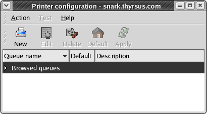
Now, those of you who are intimate with CUPS know I have already made a basic error. I shouldn't be trying to create a new print queue on snark and then glue it to the server on minx, at all. Instead, if I want to pass print jobs to minx, I should look at the configuration wizard, see minx's print queue already announced there, and make it snark's default. But nothing in the configuration wizard's interface even hints at that! And minx's print queue does not show, for a reason we'll discover later in this sorry saga.
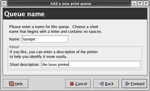
New form in the window, saying “Queue name” in equally big friendly letters. It offers a default of “printer”. I change it to “laserjet” because I might at some point want to hook up the ancient dot-matrix thingy I still have. I enter the optional short description: “the laser printer”. So far this is all good. Aunt Tillie, the archetypal nontechnical user, could handle this just fine. Forward...
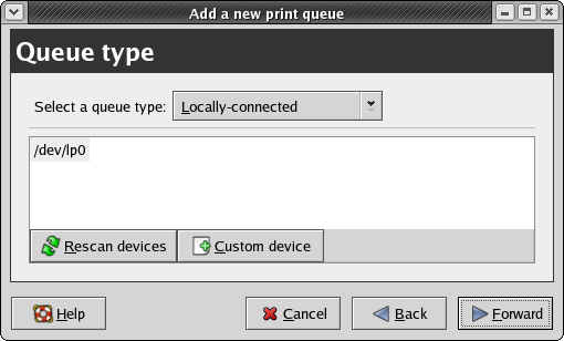
New form. “Queue type”, it says. There's a drop-down menu. The default is “Locally connected”, which is reasonable. Clicking on the menu, I am presented with the following alternatives (which I list here as text because of a technical limit in my screenshot tool):
	Networked CUPS (IPP)
	Networked Unix (LPD)
	Networked Windows (SMB)
	Networked Novell (NCP)
	Networked JetDirect
Here is our first intimation of trouble. If I were Aunt Tillie, I would at this point be thinking “What in the holy fleeping frack does that mean?” And just as importantly, “why do I have to answer this question?”" I do not, after all, have any Windows machines on my network. Nor any Netware boxes. And I certainly don't have a “Networked JetDirect”, whatever that might be.
If the designers were half-smart about UI issues (like, say, Windows programmers) they'd probe the local network neighborhood and omit the impossible entries. If they were really smart (like, say, Mac programmers) they'd leave the impossible choices in but gray them out, signifying that if your system were configured a bit differently you really could print on a Windows machine, assuming you were unfortunate enough to own one.
But no. Instead, Aunt Tillie is already getting the idea that this software was written by geeks without clue.
But wait! Wait! Hallelujah! There's a help button! I click it. Up comes a nice glossy page of on-line documentation. But instead of answering the question in my mind, which is “How do I choose the right queue type”, it is a page on adding a locally connected printer. That is, it's associated with the currently selected-by-default queue type, not the operation of choosing a queue. The help is...unhelpful.
Aunt Tillie, at this point, is either resigning herself to another session of being tortured by the poor UI choices of well-meaning idiots or deciding to chuck this whole Linux thing and go back to the old Windows box. It blue-screened a lot, but at least it allowed her the luxury of ignorance — she didn't have to know, or care, about what a JetDirect or a CUPS might be.
I am not ignorant, but I have my own equivalent of Aunt Tillie's problem. I know I want one of the top two methods, but I don't know which one. And I don't want to know or care about the difference either; I have better things to do with my brain than clutter it with sysadminning details. If the tool can detect that both methods are available on the local net (and that shouldn't be hard, they're both well-known ports) it should at least put “(recommended)” next to one so I can click and keep going.
But nooooo. Instead I have to stare at the help screen and think “Where might I find some guidance on this, and why is this already taking too freaking long?” Applying my fearsome hacker-jutsu, I try clicking “Prev”. I get a page about the printer configuration which describes the queue types, but still no guidance on how to choose between CUPS and LPD.
Obviously it never occurred to the designers of this tool that this could be an issue, either for Aunt Tillie or for the more technically ept. There is no large friendly button next to the “Select a queue type” that says “How to select a queue type”. This lack is a grave flaw in the UI design that turns the superficial spiffiness of the configuration wizard into a tease, a mockery.
Applying my fearsome hacker-jutsu once again, I guess, and select “CUPS (IPP)”. Comes now the form that turns the UI from a mockery to something worse. It presents two text fields. One is labeled “Server” and is blank. The other is labeled “Path:” and contains the string “/printers/queue1”.
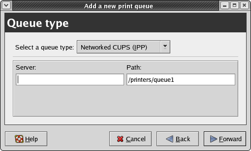
If Aunt Tillie were still along for the ride, she would be using some unladylike language right about now. And with good reason, because this is a crash landing, an unmitigated disaster. To understand why, you have to stop thinking like a hacker for a few moments. Cram your mind, if you can, back into the mindset of a clueless user. Somebody who not only doesn't know what a string like “/printers/queue1” might mean, but doesn't want to know, and doesn't think he or she ought to have to learn.
From Aunt Tillie's point of view, it's reasonable that the host field is empty; she hasn't selected one, after all. But the fact that the Path field is filled in is worse than useless, it's actually harmful — because she doesn't know what it means, and doesn't know how to tell whether or not that default would be valid if she did fill in a server name. She is stopped dead.
What she ought at this point to be seeing is one of two things: either a list of CUPS print queues available on the local network, or a big bold message that says “I don't see any queues available locally; you may need to go set up a print server.” The prompt for server/path, presented here, is a stone wall; not only does it leaves Aunt Tillie with no idea how to proceed, it is just as opaque to an experienced hacker like me.
The meta-problem here is that the configuration wizard does all the approved rituals (GUI with standardized clicky buttons, help popping up in a browser, etc. etc.) but doesn't have the central attribute these are supposed to achieve: discoverability. That is, the quality that every point in the interface has prompts and actions attached to it from which you can learn what to do next. Does your project have this quality?
In fact, the “Queue type” form is an anti-discoverable interface — it leads you right down a blind alley of trying to set up a local queue pointing to a remote server that you know can print — like my wife Cathy's machine — and then cursing because your test print attempts fail. This is, in fact, exactly what happened to me next.
I typed “minx.thyrsus.com” into the server field, on the assumption that “/printers/queue1” might be a safe default that other CUPS instances would honor. I went through the manufacturer and model screens and confirmed the queue creation. The wizard popped up a window offering to print a test page; I told it yes...and nothing happened. Actually, it was worse than nothing; the configurator window displayed a message that said ‘Network host "minx.thyrsus.com" is busy, will retry in 30 seconds’, and then (to all appearances) hung.
We are now deep in the trackless swamps created by thoughtless, feckless UI design — full of glitz and GUI, signifying nothing. This is the precise point at which I decided I was going to write a rant and started taking notes.
The “Queue type” screen gave me no clue about the existence, nonexistence, or sharable status of any print queues on my network. I have two other machines in the house, both running full Fedora Core and plugged into Ethernet; the really right thing would have been a message that said "I see CUPS demons are running on minx, golux, and grelber, but no queues are accessible." with a pointer into the CUPS documentation.
Again, the help I did get wasn't helpful. The page associated with “Networked CUPS (IPP) Printer” says "Any networked IPP printer found via CUPS browsing appears in the main window under the Browsed queues category." Oh, really? What "main window" would that be in? And it doesn't give me a clue what to do if I don't see any Browsed queues category, which is particularly wack since that is the normal, default situation for a new installation!
None of this is rocket science. The problem isn't that the right things are technically difficult to do; CUPS is already supposed to have discovery of active shareable queues as a feature. The problem is that the CUPS designers' attitude was wrong. They never stepped outside their assumptions. They never exerted the mental effort to forget what they know and sit down at the system like a dumb user who's never seen it before — and they never watched a dumb user in action!
CUPS is not alone. This kind of fecklessness is endemic in open-source land. And it's what's keeping Microsoft in business — because by Goddess, they may write crappy insecure overpriced shoddy software, but on this one issue their half-assed semi-competent best is an order of magnitude better than we usually manage.
But enough prescriptive ranting for the moment. I'm going to tell you about my efforts to research my way out of this hole, because there are some lessons there as well. First, I went looking for documentation. I did this in a Unix-hackerish way, by eyeballing the output of `locate printers` for anything in /usr/share/doc related to CUPS. I found /usr/share/doc/cups-1.1.19/printers/index.html and fired up a browser on it. It redirected me to http://localhost:631/ which was OK, though the redirect went by too fast.
And I found myself looking at a web page that was not obviously useful for troubleshooting my problem. I tried clicking on the button marked "Administration" in hopes the tool behind it would be a bit more discoverable than the configuration. I got a pop-up with a password prompt (which I can't display here becaiuse the GNOME window-capture tool doesn't do Mozilla popups correctly).
Hello? How am I supposed to know what to do with this thing? All it tells me is that it wants a “CUPS login”. Is this the same as a system root login, or is there some special funky CUPS identity I'm supposed to telepathically know about? The prompt on these password popups is configurable; it could have offered me a clue and a pointer into the documentation. It didn't.
Once again, the theme is the absence of discoverability. That password prompt, rather than being a signpost leading further into an understanding of the system, was another stone wall.
When all else fails, there's always Google. I searched on CUPS printing HOWTO and found a link to The Linux Printing HOWTO — which when I chased it, turned out to be a 404. Now that bit is probably not the CUPS designers' fault; I'm throwing it in just to establish that, at that point, I was feeling screwed, blued, and tatooed. The shiny-surfaced opacity of CUPS had, it seemed, defeated me in what should have been a trivial 30-second task.
I persevered, however. My next step was to ssh into minx and see if I could discover the name of the active CUPS queue. Maybe, I thought, if I found that out I could plug that queue name into the configuration wizard on snark and it would all work. Alas, it was not to be. The two commands that seemed possibly relevant were lpinfo(8) and lpadmin, and you can't get a list of queue names from either of them. The output of “lpinfo -v” looked like it ought to be useful, but I had no idea how to map these device URLs onto queue names.
We are now in real time. I am writing this rant as I am trying to figure out the path out of this maze. I am reading the CUPS System Administrator's Manual and it claims : “CUPS supports automatic client configuration of printers on the same subnet. To configure printers on the same subnet, do nothing. Each client should see the available printers within 30 seconds automatically. The printer and class lists are updated automatically as printers and servers are added or removed.” Well, that's very nice, but the breezy confidence of their exposition leaves me with no clue about what to do when the autoconfiguration isn't working!
I'm reading the manual, and I find a reference to “BrowseAddress” and /etc/cups/cupsd.conf which begins to unfold for me the mystery of how the autoconfiguration is supposed to work. It seems that CUPS instances periodically send broadcast packets advertising their status and available printers to a broadcast address to be picked up by other CUPS instances. Smart design! But...bugger me with a chainsaw, the broadcast facility is turned off by default and the documentation doesn't tell you that!
So, let's review. In order for the nice, user-friendly autoconfiguration stuff to work, you have to first edit an /etc file. On a different machine than the one you're trying to set up. And you have to read the comments in that configuration file to know that you need to do this in the first place.
What a truly lovely, classic blunder this is. That somebody turned off the autoconfiguration support is understandable from a security-engineering point of view. But failing to mention this in the Administrator's Guide, and failing to warn the user during the configuration-wizard dialogue that operating printers may not be visible unless your site admin has performed the appropriate ritual on the printers' host machines...that is moronically thoughtless.
This kind of crap is exactly why Linux has had such trouble gaining traction among nontechnical users — and it becomes less forgivable, not more, when it's surrounded by a boatload of GUI eye candy that adds complexity without actually delivering friendliness to the user.
I edit a correct broadcast address for my network into /etc/cups/cupsd.conf on minx. I am unsurprised to learn that the cupsd(8) man page doesn't tell me whether the standard kill -HUP will force cupsd to reread that file, because at this point I am long past expecting the documentation to be helpful. I do /etc/init.d/cups restart instead.
I write the last paragraph, then go back to the configuration wizard. A little poking at it discloses an Action→Sharing item. When I click the OK button, "Browsed queues" appears in the wizard window. Excelsior! It appears that snark is now receiving broadcat configuration info from minx. And sure enough, when I click “Browse queues” a LaserJet 6 shows up as a device. Curiously, however, it is labeled “lp0” without any indication that it's not on the local machine.
I fire up the Web interface. Sure enough, it finds the LaserJet 6 on minx. But not all is goodness. When I try to print a test page, a popup tells me “The connection was refused when attempting to contact minx.thyrsus.com:631”.
I am again unsurprised to learn that neither the user's nor the Administrator's Guide has anything to say about troubleshooting CUPS problems. The lpr(1) interface is massively unhelpful; when I submit jobs from snark, they appear to vanish into a black hole.
Eventually I notice the Listen directive in the /etc/cups/cupsd.conf file. “Aha!” says I to myself, “Maybe this is like sendmail, where you have to tell it explicitly to listen on the server's IP address.” I add “Listen 192.168.1.21”, the latter being minx's IP address, restart cupsd...and lo and behold my test job comes tumbling out of the printer.
The thing to notice here is how far behind we have left Aunt Tillie. An iron rule of writing software for nontechnical users is this: if they have to read documentation to use it you designed it wrong. The interface of the software should be all the documentation the user needs. You'd have lost the non-techie before the point in this troubleshooting sequence where a hacker like me even got fully engaged.
But in this case, the documentation was passively but severely misleading in one area, and harmfully silent in others. I eventually had to apply m4d skillz gained from wrestling with sendmail to solve a problem the CUPS documentation never even hinted about.
As I said before, the point of this essay is not especially to bash on the CUPS guys. They're no worse than thousands of projects out there, and that is the point. We talk about world domination, but we'll neither have it nor deserve it until we learn to do better than this. A lot better.
It's not like doing better would be difficult, either. None of the changes in CUPS behavior or documentation I've described would be technical challenges; the problem is that these simple things never occurred to developers who bring huge amounts of already-acquired knowledge to bear every time they look at their user interfaces.
It doesn't matter a damn whether the shoddy and unhelpful design of the printer-configuration tool came out of a CUPS brainpan or a Fedora brainpan. What matters is that whoever was responsible never audited the interface for usability with a real user.
It also doesn't matter whether the the failure of the browsing defaults in CUPS to match the documentation was a CUPS-team screwup or a Fedora screwup — Aunt Tillie doesn't care which direction that finger points, and I don't either. No, the real problem is that whoever changed the default didn't immediately fix the documentation to match it as a matter of spinal reflex.
The CUPS mess is not a failure of one development team, or of one distribution integrator. In fact, it makes a better example because the CUPS guys and the Fedora guys are both well above the median in both general technical chops, design smarts, and attention to usability. The fact that this mess is an example of our best in action, rather than our worst, just highlights how appallingly low our standards have been.
Good UI design is not a result of black magic, it just requires paying attention. Being task-oriented rather than feature-oriented. Recognizing that every time you force a user to learn something, you have fallen down on your job. And that when Aunt Tillie doesn't understand your software, the fault — and the responsibility to fix it — lies not with her but with you.
Let's go back to the queue type selection screen. Remember that one? It looks like this:
        Locally connected
	Networked CUPS (IPP)
	Networked Unix (LPD)
	Networked Windows (SMB)
	Networked Novell (NCP)
	Networked JetDirect
This is a feature-oriented menu, not a task-oriented one. The attitude it exhales is “Oooh! Look how cool it is that we support all these printer types!” But you know what? Aunt Tillie doesn't care. She doesn't want to know about all the world's printer types, she just wants to make her printer work.
A task-oriented configurator would have logic in it like this:
If the machine doesn't have an active LAN interface, gray out all the “Networked” entries.
If the machine has no device connected to the parallel port and no USB printers attached, gray out the “Locally connected” entry.
If probing the hosts accessible on the LAN (say, with an appropriately-crafted Christmas-tree packet) doesn't reveal a Windows TCP/IP stack, gray out the SMB entry.
If probing the hosts accessible on the LAN doesn't reveal a Novell Netware NCP stack, gray out the NCP entry.
If probing the hosts accessible on the LAN doesn't reveal a Jet-Direct firmware TCP/IP stack, gray out the JetDirect entry.
If all Unix hosts on the LAN have CUPS daemons running, gray out the LPD entry.
If the preceding rules leave just one choice, so inform the user and go straight to the form for that queue type.
If the preceding rules leave no choices, complain and display the entire menu.
The technical details of these tests aren't important, and anybody who writes me arguing for a different set will have fixated on the wrong level of the problem. The point is that, unlike a command tool for techies that should give them lots of choices, the goal of a GUI is to present the user with as few decision points as possible. Remember the Macintosh dictum that the user should never have to tell the machine anything that it knows or can deduce for itself.
“As few as possible decision points” is another way of stating the guiding principle of good UI design for end-users: Allow the user the luxury of ignorance. This does not mean that you can't reward acquired knowledge with more choices and more power; you can and should do that. But the user should also be able to choose to remain ignorant and still get all their basic tasks done. The more thoroughly software developers internalize the truth that real users have better things to do with their time and attention than worship at the shrine of geek technical prowess, the better off everyone will be.
xine is a project aiming to provide full support for playback of video and audio multimedia on Linux computers. The project maintainers ship several components that partition the task in a traditionally Unixy fashion: these include both xine-lib (a library which provides an API for multimedia playback) and xine-ui (a GUI front end that exercises the library). Comments here apply to the 0.9.22 version released in late 2003.
The xine-lib API is documented, and several alternate front ends have been written for it. One of these is gxine, intended to be run as part of the GNOME desktop environment and shipped by the xine project itself. Another is totem, a third-party front end written by developers dissatisfied with xine-ui and gxine.
The designers of xine-ui appear to have taken their cue from a popular audio player, xmms (remarks here apply to version 1.2.8). The GUI concept of the xmms UI is that it imitates the look and feel of the sort of small CD or tape player that one might install in one's car. The appearance of xmms is customizable by selecting one of about two dozen skins. All supply the same dozen or so controls, which are mainly buttons with the play/pause/stop and other graphic labels familiar from consumer electronics. Options and less-frequently-used controls can be reached through a pulldown menu activated by the right mouse button.
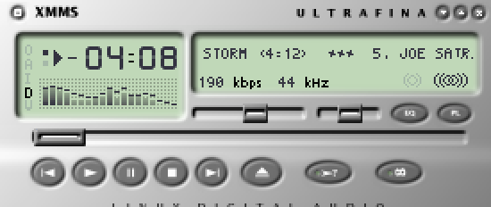
The UI of xmms works pretty well. It makes effective use of the Rule of Least Surprise, and will be readily discoverable by anyone who has used physical stero equipment. There is trouble narrowly avoided in one of the options. which is to double-size the xmms panel. The panel and its skins were designed as graphics with a fixed pixel height and width for 72-dot-per-inch displays; they look too small when thrown on the 100dpi pixel density characteristic of 19-inch and larger displays. Because xmms uses only a large and relatively crude font simulating those found on an LCD display, the track-title marquee is readable even without double-sizing on a 100dpi display, and scales up nicely when that option is enabled.
The xine-ui GUI is based on applying a very similar design concept to a much more elaborate set of controls; the authors have tried to make it look like the control panel on an expensive home entertainment center. Visually, they succeeded. On first acquaintance xine-ui and the large collection of skins available for it look very impressive — so much so that it can actually be a guilt-inducing experience to discover that the xine-ui GUI is nigh-unusable. It's easy to think that if the developers put such effort into making it pretty, any difficulties in using it must be due to one's own stupidity.
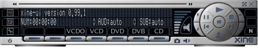
But there are severe design problems here, problems which arise from the choice of a visually attractive metaphor that leads to poor ergonomics. The main panel features lots of buttons labeled in small fonts, many of which (unlike those on the xmms panel) look alike. Thus, it is difficult to operate the GUI without reading the labels next to each button. Labels which are in low-contrast gray on black.
Worse, as with xmms skins, the xine-ui panels were designed as fixed-size graphics on a 72dpi monitor. The fonts are baked into the skin along with the control graphics, and don't scale, The legends are difficult to read at 72dpi; at 100dpi, they are impossible. There is no double-size option, and if there were it would turn small, spidery, eye-straining labels into larger, blurry, eye-straining labels.
The combination of overemphasis on surface gloss and skinnability with complete failure to address the problem of varying display resolutions is telling — particularly since technology trends give us every reason to expect that what is ultra-high-resolution today will be normal in a few years. This is what happens when programmers pursue usability in a superficial way, doing things that make their interfaces attractive for the first thirty seconds and a trial to use forever after.
But the mis-design of the UI goes beyond the appearance of xine-ui and deep into its interface logic. The application's control menus, when you can find them, are complicated and confusing, replete with cryptic abbreviations that don't make sense unless one is already immersed in audio/video jargon. Despite the surface gloss, it's an interface written by geeks for other geeks. Most nontechnical end-users, presented with it, would run screaming.
All in all, xine-ui is a dreadful example of what happens when developers mistake visual polish for usability. It is all the more powerful an example because it is such an elaborate and energetic execution of a bad idea.
The designers of gxine and totem have demonstrated that a xine front end doesn't have to be that way. They abandoned the goal of looking pretty. Instead, they focused on usability and created front ends with far simpler interfaces. Notably, gxine usees the same set of standard consumer-electronic icons for play/stop/pause, etc., that gxine does. Also, gxine comes closer than xine-ui, to obeying the Rule of Seven; there are exactly ten visible controls (not counting the pull-down menus).
Figure 5.7. gxine
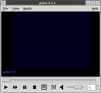
gxine running under GNOME. The window frame is not part of gxine itself; it is generated by Sawfish, the default GNOME window manager, under the Bluecurve theme used by Fedora.
What lessons can we draw from the xine debacle and the totem and gxine recovery?
At least one lesson is not new. Just before the turn of the millennium Macintosh interface guru Bruce Tognazzini observed “In the hands of an amateur, slavish fidelity to the way a real-world artifact would act is often carried way too far.” It is perhaps not coincidental that the egregious example he was condemning was another media player, Apple's QuickTime 4.0. Its numerous blunders, parallelling those of xine, were well dissected in [Turner].
At least one xine interface mistake that QuickTime 4.0 avoided was to plow a lot of effort into supporting skins. Skinnability is a two-edged sword. As a feature of a fundamentally sound UI design, it can help users feel empowered. But, as the xine case shows, skinnability can also be a psychological and technical problem. Psychologically, it may give developers a misplaced sense of accomplishment, distracting them from other issues like poor discoverability due to complex and crptic menus. Technically, it may pin them to methods which don't adapt well as background realities like monitor dot pitches change.
We come now to the part of getting good at user interface design that we predict most programmers will find hardest to accept — the debugging and testing techniques.
Sadly, most programmers have no history of debugging user interfaces with the amount of attention and respect they would give (say) network interfaces. With network procols, you begin the job by finding out what the requirements of other side are. If you have to deal with byte-order issues, or ASCII-EBCDIC translation, or the application has strange latency requirements, you cope. But you would never assume that a protocol you simply dreamed up in your own head after reading the requirements will work first time; you have actually try it out and see how it works on a real system.
In UI design the users have alaborate requirements, which we've explored in earlier chapters. For writing a good UI, mere theoretical knowledge of those requirements is not enough. You cannot expect to deploy an untested prototype and expect life to be good without tweaking in response to real-world feedback. You need to try your design out with actual users resembling your target population, and iteratively adjust to respond to their needs — just as you would when communicating with any other piece of quirky hardware.
In this chapter, we'll explain two methods for collecting that real-world feedback. The first — heuristic evaluation — is useful for the early stages of debugging an interface. It's good for catching single-point usability problems, places where the interface breaks the design rules presented in this book. The second — end-user testing — is the true reality check, where you will find out if you have problems that go beyond single-point failures into the entire design metaphor of the interface.
You can integrate these methods with story-based design into a four-step recipe that can be performed even by the relatively lightweight, low-budget, non-hierarchical development organizations characteristic of open-source projects.
The four steps of this recipe, which you can repeatedly cycle through as your project evolves, are:
- Persona-based design
- Heuristic evaluation by the developers
- Heuristic evaluation by non-developers
- End-user testing
We've already discussed persona-based design at the end of the Wetware chapter. By keeping the requirements of fictive but emotionally real users foregrounded during design, this technique naturally leads into involving real users later in the cycle. By keeping developers in some kind of identification with real users, it helps them avoid the kinds of errors that can make end-user testing a punishing, scarifying experience for all parties involved.
This appendix collects references to all the design rules developed after Chapter 1.
Rule of Optional Color: Use color to emphasize, but never convey information through color alone; combiine it with other cues like shape, position, and shading.
Rule of Large Menus: One large menu is more time-efficient than several small submenus supporting the same choices.
Rule of Target Size: The size of a button should be proportional to its expected frequency of use.
Rule of the Infinite Edge: The easiest target rectangles on the screen are those adjacent to its edges.
Table of Contents
There is a vast literature on user-interface design and humman-computer interaction. Unfortunately, much of it is useless to the working Unix programmer. One major reason is that a lot of it is actually academic analysis of human task performance, the computer equivalent of time-and-motion studies — interesting for its own sake, but difficult to translate into practical advice. Advocacy for elaborate interface-prototyping systems and mockups is another theme; this doesn't make much sense in Unix-land, where scripting languages with toolkit bindings make a working prototype almost as easy to throw together as a mockup.
We've tried to select a short list of the sources we have found most useful, and to indicate why they were useful. You'll find pointers to a much larger cross-section of the literature, helpfully categorized by topic area, at the website Suggested Readings in Human-Computer Interaction (HCI), User Interface (UI) Development, & Human Factors (HF).
[[Bush]] Atlantic Monthly. “As We May Think”. July 1945. The pioneering essay on hypetext that inspired the GUI and
the World Wide Web.Available on the
Web..
[[Cooper]] The Inmates Are Running the Asylum. Sams. 1999. ISBN 0-672-31649-8.
This book combines a trenchant and brilliant analysis of what's wrong with software interface designs with a prescription for fixing it that we think is mistaken; Cooper is a strong advocate of separating interaction design from programming. If you can learn from the criticism and ignore the self-promotion and empire-building, this is a very valuable book.
[[DeMarco&Lister]] PeopleWare: Productive Projects and Teams. Dorset House. 1987. ISBN 0-932633-05-6.
A truer classic on the coinditions necessary to support creative work. Has much to say about avoiding interruptions that is just as important to UI designers as program managers.
[Eckel] Thinking in Java. 3rd Edition. Prentice-Hall. 2003. ISBN 0-13-100287-2.
Probably the best single intoduction to Java ns its GUI environment. Available on the Web.
[[Miller]] The Psychological Review. “The Magical Number Seven, Plus or Minus Two”. Some limits on our capacity for processing information. 1956. 63. pp. 81-97.
[[Lewis&Rieman]] Task-Centered User Interface Design. http://hcibib.org/tcuid/. 1994.
A “shareware book” about UI design published on the Web. This is a good painless introduction to the topic, sensibly focusing on issues like attention and cognitive load. The authors have more to say about the visual aspects of design than we do here.
[[Nielsen&Molich]] Heuristic Evaluation of User Interfaces Methodology. Proceedings of CHI'90 Conference on Human Factors in Computing Systems. Association for Computing Machinery. 1990. “Heuristic Evaluation of User Interfaces”.
This is the paper that proposed the Nielsen-Molich heuristics and the evaluation method associated with them. Here is the authors' abstract:
Heuristic evaluation is an informal method of usability analysis where a number of evaluators are presented with an interface design and asked to comment on it. Four experiments showed that individual evaluators were mostly quite bad at doing such heuristic evaluations and that they only found between 20 and 51% of the usability problems in the interfaces they evaluated. On the other hand, we could aggregate the evaluation from several evaluators to a single evaluation and such aggregates do rather well, even when they consist of only three to five people.
[Nielsen] Usability Engineering. Morgan Kaufmann. 1994. ISBN 0-12-518406-9.
This book includes the developed version of the Nielsen-Molich heuristics we cite in the Premises chapter. A table of contents is available on the Web.
[Norman] The Design of Everyday Things. Currency. 1990. ISBN 0-385-267746.
A classic on industrial design. Some of the material related to computers is a bit dated now, but the principles and criticisms in this book are still valuable.
[[Raskin]] The Humane Interface. Addison-Wesley. 2000. ISBN 0-201-37937-6.
A summary is available on the Web.
[[Turner]] A Worm in the Apple?. salon.com. 1999.
A merciless dissection of the UI design blunders in Apple's QuickTime 4.0 multimedia player. Available on the Web