xine is a project aiming to provide full support for playback of video and audio multimedia on Linux computers. The project maintainers ship several components that partition the task in a traditionally Unixy fashion: these include both xine-lib (a library which provides an API for multimedia playback) and xine-ui (a GUI front end that exercises the library). Comments here apply to the 0.9.22 version released in late 2003.
The xine-lib API is documented, and several alternate front ends have been written for it. One of these is gxine, intended to be run as part of the GNOME desktop environment and shipped by the xine project itself. Another is totem, a third-party front end written by developers dissatisfied with xine-ui and gxine.
The designers of xine-ui appear to have taken their cue from a popular audio player, xmms (remarks here apply to version 1.2.8). The GUI concept of the xmms UI is that it imitates the look and feel of the sort of small CD or tape player that one might install in one's car. The appearance of xmms is customizable by selecting one of about two dozen skins. All supply the same dozen or so controls, which are mainly buttons with the play/pause/stop and other graphic labels familiar from consumer electronics. Options and less-frequently-used controls can be reached through a pulldown menu activated by the right mouse button.
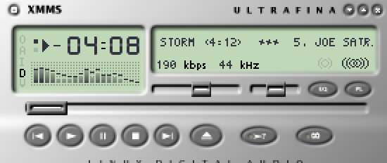
The UI of xmms works pretty well. It makes effective use of the Rule of Least Surprise, and will be readily discoverable by anyone who has used physical stero equipment. There is trouble narrowly avoided in one of the options. which is to double-size the xmms panel. The panel and its skins were designed as graphics with a fixed pixel height and width for 72-dot-per-inch displays; they look too small when thrown on the 100dpi pixel density characteristic of 19-inch and larger displays. Because xmms uses only a large and relatively crude font simulating those found on an LCD display, the track-title marquee is readable even without double-sizing on a 100dpi display, and scales up nicely when that option is enabled.
The xine-ui GUI is based on applying a very similar design concept to a much more elaborate set of controls; the authors have tried to make it look like the control panel on an expensive home entertainment center. Visually, they succeeded. On first acquaintance xine-ui and the large collection of skins available for it look very impressive — so much so that it can actually be a guilt-inducing experience to discover that the xine-ui GUI is nigh-unusable. It's easy to think that if the developers put such effort into making it pretty, any difficulties in using it must be due to one's own stupidity.

But there are severe design problems here, problems which arise from the choice of a visually attractive metaphor that leads to poor ergonomics. The main panel features lots of buttons labeled in small fonts, many of which (unlike those on the xmms panel) look alike. Thus, it is difficult to operate the GUI without reading the labels next to each button. Labels which are in low-contrast gray on black.
Worse, as with xmms skins, the xine-ui panels were designed as fixed-size graphics on a 72dpi monitor. The fonts are baked into the skin along with the control graphics, and don't scale, The legends are difficult to read at 72dpi; at 100dpi, they are impossible. There is no double-size option, and if there were it would turn small, spidery, eye-straining labels into larger, blurry, eye-straining labels.
The combination of overemphasis on surface gloss and skinnability with complete failure to address the problem of varying display resolutions is telling — particularly since technology trends give us every reason to expect that what is ultra-high-resolution today will be normal in a few years. This is what happens when programmers pursue usability in a superficial way, doing things that make their interfaces attractive for the first thirty seconds and a trial to use forever after.
But the mis-design of the UI goes beyond the appearance of xine-ui and deep into its interface logic. The application's control menus, when you can find them, are complicated and confusing, replete with cryptic abbreviations that don't make sense unless one is already immersed in audio/video jargon. Despite the surface gloss, it's an interface written by geeks for other geeks. Most nontechnical end-users, presented with it, would run screaming.
All in all, xine-ui is a dreadful example of what happens when developers mistake visual polish for usability. It is all the more powerful an example because it is such an elaborate and energetic execution of a bad idea.
The designers of gxine and totem have demonstrated that a xine front end doesn't have to be that way. They abandoned the goal of looking pretty. Instead, they focused on usability and created front ends with far simpler interfaces. Notably, gxine usees the same set of standard consumer-electronic icons for play/stop/pause, etc., that gxine does. Also, gxine comes closer than xine-ui, to obeying the Rule of Seven; there are exactly ten visible controls (not counting the pull-down menus).
Figure 5.7. gxine
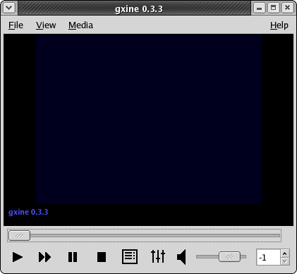
gxine running under GNOME. The window frame is not part of gxine itself; it is generated by Sawfish, the default GNOME window manager, under the Bluecurve theme used by Fedora.
What lessons can we draw from the xine debacle and the totem and gxine recovery?
At least one lesson is not new. Just before the turn of the millennium Macintosh interface guru Bruce Tognazzini observed “In the hands of an amateur, slavish fidelity to the way a real-world artifact would act is often carried way too far.” It is perhaps not coincidental that the egregious example he was condemning was another media player, Apple's QuickTime 4.0. Its numerous blunders, parallelling those of xine, were well dissected in [Turner].
At least one xine interface mistake that QuickTime 4.0 avoided was to plow a lot of effort into supporting skins. Skinnability is a two-edged sword. As a feature of a fundamentally sound UI design, it can help users feel empowered. But, as the xine case shows, skinnability can also be a psychological and technical problem. Psychologically, it may give developers a misplaced sense of accomplishment, distracting them from other issues like poor discoverability due to complex and crptic menus. Technically, it may pin them to methods which don't adapt well as background realities like monitor dot pitches change.