1987 was a significant year in yet another respect. That was when the 386, the first true 32-bit Intel chip, became generally available and opened up the possibility of Unix machines built with cheap commodity hardware. 32-bit PC hardware ate into the workstation and classical Unix-based minicomputer/server markets with increasing speed after 1990.
But the 32-bit Unix-capable PC affected GUI design surprisingly little over the next ten years. We have already noted its most important consequence in the widespread availability of high-resolution color displays. Elsewhere, the basic features of the PARC pattern remained stable. The Macintosh interface changed hardly at all. Unix GUIs retained their relatively severe, functional look. The GUI to benefit most from the new wave of 32-bit machines was that of Microsoft Windows.
As the 1980s drew to a close, Microsoft got the hang of emulating the Macintosh version of the PARC pattern more closely. But where Apple left most design decisions up to its skilled cadre of in-house interface experts, Microsoft focus-grouped new versions relentlessly. Thus, while Microsoft's designs were derivative and poorly integrated, they did a better job than Apple of providing the individual features that actual customers were asking for. Responsiveness to customer feedback, saturation marketing, and the steadily rising resolution of color screens would help make Windows 3.1 a huge success in 1992.
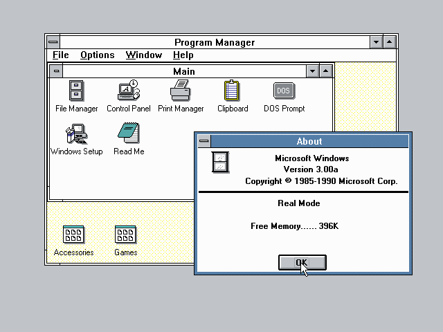
These were the critical years in which Microsoft cemented its desktop dominance and relegated Apple to niche markets. At least one lesson for today's GUI designers should be clear: never neglect the Rule of Reality! Apple's artistic vision of a clean, consistent, almost flawlessly integrated GUI lost over 90% market share to a design that was far messier and more contingent, but ruthlessly customer-focused.
In 1995, Windows 95 would be an even bigger success. It was dramatically more capable than 3.0/3.1, representing the largest increment of capabilities ever in a single Microsoft release.
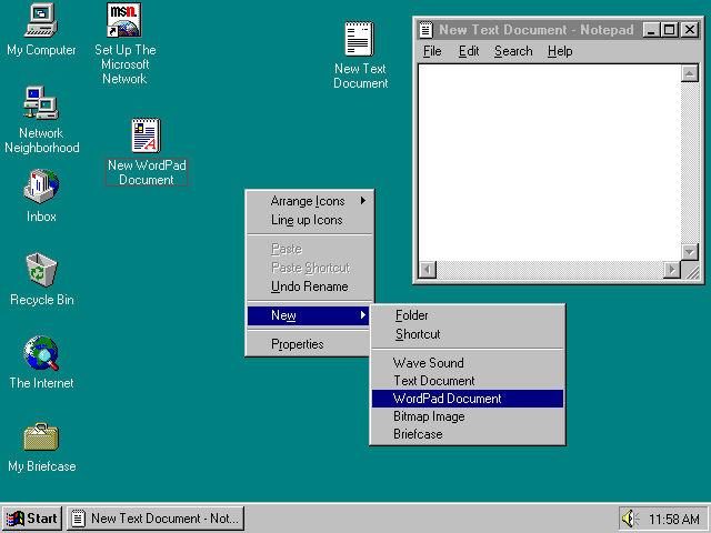
Some points to note about the Windows 95 screenshot are the resizing thumb at the lower-right-hand corner of the Notepad window, the menu bar, and the presence of documents on the desktop background. These, which first appeared in Windows 95, are representative of many other borrowings from the Macintosh GUI.
If the triumph of Windows 95 was the perfect case study in the Rule of Reality, Microsoft's one serious attempt to actually innovate in GUI design became an equally salutary lesson in the consequence of ignoring the Rule of Respect. That attempt was Microsoft Bob, a suite of eight programs intended to sit atop Windows 95 and modulate its UI into something more “user-friendly”.
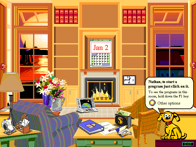
The theory behind Bob was to replace the specialized metaphors of the PARC-style desktop with a pseudo-spatial virtual reality in which programs and documents were represented by familiar, everyday objects. The crude graphics of the home screen are an instant clue to what went wrong; in practice, Bob was a cartoonish, cloying interface populated by “Personal Guides” whose saccharine pseudo-friendliness failed to mask extreme mechanical stupidity.
Microsoft Bob became the worst flop in Microsoft's history, a debacle so embarrassing that the company destroyed all copies of the software it could get its hands on and attempted to erase the entire episode from the public record. The only “Bob” novelty to survive its demise was none other than Clippy, the painfully distracting “assistant” in Microsoft Word. Despite repeated later paeans to “innovation”, Microsoft has never since attempted any advance in GUI design that went deeper than improved eye candy. Once again, the next steps forward came out of the Unix world.